
Showing posts with label OUGD203. Show all posts
Showing posts with label OUGD203. Show all posts
Friday, 27 May 2011

Thursday, 26 May 2011
Evaluation... Product, Range, Distribution
I enjoyed reading through the briefs before the brief started properly, it really opened my eyes to the diversity of briefs out there, and showed how terribly they can be written too. I selected 5 briefs, not having a clue what we were doing with them, but secretly preferring one in particular, Channel X.
Forming the brief was incredibly challenging, I am used to being given a brief with a small amount of flexibility and a given set of deliverables. This time however, we were forming our own briefs, using the chosen ones as a foundation. This proved very time consuming for me, as I am not the kind of person to jump straight into a project, without ‘testing the water first’.
After my first concept crit I was still unsure, and spoke to different members of the group to gain their opinion. A chat with Fred made me realise I had to stop writing and start making decisions and getting on with it. The brief wasn’t long enough for hesitations. I decided on the idea of a music channel, but changed the genre numerous times. When I noticed people sketching, I realised I have to decide and just get on with it, and I am glad I did.
It was this hesitation that lead to my quick development of the logo, I was worried I had fallen behind, and made a rapid decision before fully exploiting all avenues. Looking back now, I am actually glad I did this, as it allowed me to concentrate on the development of my work.
I am pleased with the identity I built for my channel, Infrasonic. A lot of people have commented on the ‘I’ being made up of graphic equaliser bars, which leads me to believe it is a strong logo. It had to be strikingly obvious it is related to music, as infrasonic isn’t a regularly used word and may cause confusion.
I think I exploited the range well across a variety of formats. The postcard idea is appropriate as people can keep them, with the chance of people they know seeing them too. The posters for nightclubs and music shops was an idea to directly target music lovers, I can imagine the postcards being distributed in locations like this also. The London Underground advert was an idea designed to expose the logo to the public, regular tube users would get used to the design and it may encourage them to look at the channel. Similarly, the outdoor billboard advert was another strategy for exposing the logo, with not as much information, as it would only be seen on the go. It wouldn’t be something people stand and stare at like they would in a tube station. The web banner was a way of expanding my communication, again directly targeting music fans, but more specialised as the featured websites would be Drum and Bass Arena and Mixmag. The magazine advert was about targeting television watchers e.g. featuring in television guides and again, Mixmag.
My proposed range was not as strong, for example, the website. I believe this is because other elements were included that weren’t part of the branding. Also, I am really upset about my ident, I would like my speciality to be motion graphics and felt this would be a fantastic opportunity to engage in my area of interest, ready to set myself up for the third year. After some development and a tutorial, the feedback wasn’t overly positive, I went away, corrected the areas for improvement and again, still nothing great. However, peers had really liked the idea, and thought it should be a product rather than proposal. I must admit, I didn’t do anything new visually in After Effects to try it, although I did pick up some technical knowledge.
I feel my boards communicate everything that is necessary, and are much better in layout than my pre-submission boards which had far too much information on.
I would really like to propose an event, a launch party for the music channel, I think it would work really well, and it was mentioned by 2 peers at separate occasions. Sadly, time was thin, and I had enough to sort out.
Forming the brief was incredibly challenging, I am used to being given a brief with a small amount of flexibility and a given set of deliverables. This time however, we were forming our own briefs, using the chosen ones as a foundation. This proved very time consuming for me, as I am not the kind of person to jump straight into a project, without ‘testing the water first’.
After my first concept crit I was still unsure, and spoke to different members of the group to gain their opinion. A chat with Fred made me realise I had to stop writing and start making decisions and getting on with it. The brief wasn’t long enough for hesitations. I decided on the idea of a music channel, but changed the genre numerous times. When I noticed people sketching, I realised I have to decide and just get on with it, and I am glad I did.
It was this hesitation that lead to my quick development of the logo, I was worried I had fallen behind, and made a rapid decision before fully exploiting all avenues. Looking back now, I am actually glad I did this, as it allowed me to concentrate on the development of my work.
I am pleased with the identity I built for my channel, Infrasonic. A lot of people have commented on the ‘I’ being made up of graphic equaliser bars, which leads me to believe it is a strong logo. It had to be strikingly obvious it is related to music, as infrasonic isn’t a regularly used word and may cause confusion.
I think I exploited the range well across a variety of formats. The postcard idea is appropriate as people can keep them, with the chance of people they know seeing them too. The posters for nightclubs and music shops was an idea to directly target music lovers, I can imagine the postcards being distributed in locations like this also. The London Underground advert was an idea designed to expose the logo to the public, regular tube users would get used to the design and it may encourage them to look at the channel. Similarly, the outdoor billboard advert was another strategy for exposing the logo, with not as much information, as it would only be seen on the go. It wouldn’t be something people stand and stare at like they would in a tube station. The web banner was a way of expanding my communication, again directly targeting music fans, but more specialised as the featured websites would be Drum and Bass Arena and Mixmag. The magazine advert was about targeting television watchers e.g. featuring in television guides and again, Mixmag.
My proposed range was not as strong, for example, the website. I believe this is because other elements were included that weren’t part of the branding. Also, I am really upset about my ident, I would like my speciality to be motion graphics and felt this would be a fantastic opportunity to engage in my area of interest, ready to set myself up for the third year. After some development and a tutorial, the feedback wasn’t overly positive, I went away, corrected the areas for improvement and again, still nothing great. However, peers had really liked the idea, and thought it should be a product rather than proposal. I must admit, I didn’t do anything new visually in After Effects to try it, although I did pick up some technical knowledge.
I feel my boards communicate everything that is necessary, and are much better in layout than my pre-submission boards which had far too much information on.
I would really like to propose an event, a launch party for the music channel, I think it would work really well, and it was mentioned by 2 peers at separate occasions. Sadly, time was thin, and I had enough to sort out.
Final Postcard
This is the final design of my postcard, which is double sided, and features the launch date on the back. Again, it is similar in layout to the other landscape format designs.
Size: 12.16cm x 8.65cm.
Stock: Satin Gloss - to reflect light, and enhance the bright colours used.


Size: 12.16cm x 8.65cm.
Stock: Satin Gloss - to reflect light, and enhance the bright colours used.
FRONT:

REVERSE:

Final Web Banner
This is the final design for the web banner, which will be a static image, to appear on sites such as Mixmag and Drum and Bass Arena, as shown in the mock ups further down. I selected this design as it was similar in layout to my other landscape format designs, and I wanted to create uniformity across the range.

Due to space restrictions I was unable to fit the date in neatly, so in this case, the web banner, is only for the day the channel launches.

Due to space restrictions I was unable to fit the date in neatly, so in this case, the web banner, is only for the day the channel launches.
Final Billboard
Here is the finished design for the billboard, it is similar in layout to the Underground design, only with the date omitted, as this advert will be displayed when the channel has launched. Again, the text is the same format, but this is good for practicality, it will be easier for drivers to read down than across the board.

This is how my design may look in context:


This is how my design may look in context:

Final Underground Board
This is the final chosen design for the 48 Sheet Underground board. The reason for this selection, is I like how the type directs the readers eyes to the logo. And it has an equaliser type effect due to the lines of type being different lengths. It features all the necessary information which is neatly grouped together without looking to cramped.

Here is what it might look like in context:

The idea behind this advert is for the piece to be on design a week or two before the launch, to expose the logo and design, so it becomes familiar before the launch itself. This will be a more detailed board than the outdoors billboard as on the Underground, people will stand around waiting for a tube, so will be more likely to take the time to read it. The bright colours against the black should draw them in.

Here is what it might look like in context:

The idea behind this advert is for the piece to be on design a week or two before the launch, to expose the logo and design, so it becomes familiar before the launch itself. This will be a more detailed board than the outdoors billboard as on the Underground, people will stand around waiting for a tube, so will be more likely to take the time to read it. The bright colours against the black should draw them in.
The design of my postcard says, 'Get ready for the launch', but as there is quite a lot of text on the design already, I didn't want to add another, as I liked the layout already.
Wednesday, 25 May 2011
Web Banner in Context
This isn't the final mock ups, I just wanted to see how the colours would work with the banner, and how it would look in the format of a banner, as I haven't tried using the elements in this way yet...
Mixmag is the kind of website I would like my banner to appear on, here is a mock up of how it may look:

Another website is Drum and Bass Arena. As the colours of the surrounding area of the banner are black, I have colour matched the yellow and given the banner a stroke to help it advance.

Mixmag is the kind of website I would like my banner to appear on, here is a mock up of how it may look:

Another website is Drum and Bass Arena. As the colours of the surrounding area of the banner are black, I have colour matched the yellow and given the banner a stroke to help it advance.

Web Banner Layouts

Here are some sample layouts for my web banner. This would be a static image. Once I have designed my other material I can select a design for my final resolution.
Tuesday, 24 May 2011
Final Crit
A successful crit, and I thoroughly enjoyed seeing a different set of people's ideas... In our group there was Maya, Chris, Richard, Paul, Chris (Starkie) Ceara and myself. I had already seen Ceara's so it was good to see how her work had progressed.


Really useful feedback... I understand I didn't make clear what the 48/96 sheet poster meant, but I will rectify this for my final boards. And the layout of the boards were not how I envisaged my finals, but somehow felt I had to explain everything word for word, as the previous crit there wasn't enough information, so yes I really need to restructure my boards. I really like the sound of mocking up a 'night' and I actually had thought of this the day before, time is thin so I will have to see. And again, the interactive bus poster idea Paul mentioned, I think I could link this in with my proposed LCD Underground display.
Feedback from Maya:


I completely agree I should probably present the posters in context. With regards to the comment about targetting my audience on the underground, I thought it would be appropriate due to the mass volume of people that would be exposed to it, including my audience who are fans of the music genres, and potential fans in the future. Again, a comment about the boards, I agree, the layout needs to be more consistent, and this will be resolved in time for submission. The web banner for music sites is a good idea, I have proposed this but not got to the stage of carrying it through, so I will look into this.
There was a comment about printed music channel ads, and I should look at them, I have found a huge lack of this material! Otherwise it would have been my first port of call.
Feedback from Starkie (Chris):


Feedback from Paul:


Really useful feedback... I understand I didn't make clear what the 48/96 sheet poster meant, but I will rectify this for my final boards. And the layout of the boards were not how I envisaged my finals, but somehow felt I had to explain everything word for word, as the previous crit there wasn't enough information, so yes I really need to restructure my boards. I really like the sound of mocking up a 'night' and I actually had thought of this the day before, time is thin so I will have to see. And again, the interactive bus poster idea Paul mentioned, I think I could link this in with my proposed LCD Underground display.
Feedback from Maya:


I completely agree I should probably present the posters in context. With regards to the comment about targetting my audience on the underground, I thought it would be appropriate due to the mass volume of people that would be exposed to it, including my audience who are fans of the music genres, and potential fans in the future. Again, a comment about the boards, I agree, the layout needs to be more consistent, and this will be resolved in time for submission. The web banner for music sites is a good idea, I have proposed this but not got to the stage of carrying it through, so I will look into this.
There was a comment about printed music channel ads, and I should look at them, I have found a huge lack of this material! Otherwise it would have been my first port of call.
Feedback from Starkie (Chris):


It seems I really baffled people talking about the 48/96 sheet poster size! I think there was some miscommunication about me producing a magazine - I only stated I was producing an A4 advert for a magazine. Great idea about stencilling or spray painting logo, but as pointed out by Starkie, time is running out. Although it could look really good! And a spelling error, due to a fault letter a I have, I have had to copy and paste the letter a into words!!
In summary, a very productive crit! Great to see such a high standard of work from everyone.

Monday, 23 May 2011

Underground Advertising Placement
Here I have created an image in Photoshop to show how my billboard might look on the Underground. This would be for a 48 page ad.

The Photoshop isn't very good quality, so I re-did it in Illustrator, much better quality, I don't know why I didn't do this the first time round, could have saved me time!! *Learn from this Gemma.


The Photoshop isn't very good quality, so I re-did it in Illustrator, much better quality, I don't know why I didn't do this the first time round, could have saved me time!! *Learn from this Gemma.


Screen Guidelines
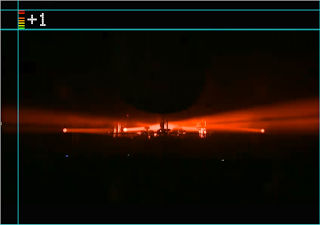
The logo should only ever be in this position during programmes and music videos. At the commercial break it will disappear.


Sunday, 22 May 2011
Pre-plan for Boards

Subject to change...
As I have five boards which potentially would be quite full, and still have lots more to put on them...
Friday, 20 May 2011
Print Guidelines
PORTRAIT FORMAT:

The height of the Infrasonic logo should be equivalent to half the height of the document.

LANDSCAPE FORMAT:
The Virgin and Sky logos should be on the left, with the logo on the right.

The Infrasonic logo should be three quarters of the size of the document.

BOTH:
The font should be Electronic Highway Sign:

More Magazine Ad Layouts

More magazine layouts for a full page ad, this time including the genre of the channel, as the original ideas were not explicit enough. I can get away with putting more information on as people will have the time to read it, whereas posters are often seen on-the-go, and so people may not remember as much, especially, date and channel number.
Tutor Chat
Had a chat with Fred about the progress with my work...
Suggestions:
- Different typeface for each genre - in order to successfully communicate - at the minute it seems I am trying to reinvent the visuals for drum and bass ( usually loud, garish, in your face) to a more simplistic design, my design. Fred pointed out that I can't really do that, and I now completely understand as he put it 'you are paying for driving lessons but will only ride a horse' or something to that effect.
- Different equalizer for each genre? Again, to portray that style of music.
- Use references from my Design Context - don't reinvent!!
- Focus on what's there already- grasp the visual language of the music.
- If the idents are not pulling together, propose them.
- Focus on printed media and see what time is left.
- Don't let After Effects dictate me!!
Suggestions:
- Different typeface for each genre - in order to successfully communicate - at the minute it seems I am trying to reinvent the visuals for drum and bass ( usually loud, garish, in your face) to a more simplistic design, my design. Fred pointed out that I can't really do that, and I now completely understand as he put it 'you are paying for driving lessons but will only ride a horse' or something to that effect.
- Different equalizer for each genre? Again, to portray that style of music.
- Use references from my Design Context - don't reinvent!!
- Focus on what's there already- grasp the visual language of the music.
- If the idents are not pulling together, propose them.
- Focus on printed media and see what time is left.
- Don't let After Effects dictate me!!
Really useful chat, it helped to put my ideas into perspective.


Thursday, 19 May 2011
Ident 2
This is my second ident, the beginning section is the same, but with the ending being slightly different.
After thought: maybe the Virgin media and Sky logos should come on with the line of text?
Subscribe to:
Posts (Atom)