Showing posts with label OUGD202. Show all posts

Tuesday, 15 February 2011

Top Ten... Packaging

I struggle with packaging, and found it hard to come up with anything innovative and different. I created a really simple design on card for stability, with folded paper sides to allow ease if access for the DVD. The top of the cover has the clapper board pattern, attached by a split pin to create the 'And Action!' idea. This communicates Hollywood, however I am not sure if it communicates the feminine side of the subject matter... I think glitter would be a little bit sickly!

The prototype:


The final packaging:


Top Ten... Evaluation

The problem I intended to solve was to promote a programme, The Top Ten Female Icons of Hollywood, in the form of a 50 second title sequence, accompanied by 4 promotional idents between 5 and 10 seconds in duration. This has developed from my original idea, 'Top Ten Best Female Icons', for one this is a little clumsy sounding, and as pointed out by my peers in a crit, this was incredibly misleading, I then decided to rename to, 'Top Ten Feminine Icons' before settling with my final title as visually I had more ideas, and found it more interesting, plus choosing Hollywood, gave me a bit more focus.

I feel my idents and title sequence really communicate the idea of Hollywood, and I incorporated a number of elements from this 'world' to really home in on the subject matter. The animations aren't very 'feminine' which may deceive some viewers, but I felt creating something subtly feminine, for example the Honey Script font, which is not as overpowering as flowers, bunnies and pretty colours. My main visual aim was glamour, this is Hollywood.
For this reason, I chose quite a serious tone of voice, but still light hearted as my audience is for young females, 16-25. I felt this would apply to them as this audience are interested in fame and glamour, and with the popularity of shows like 'The Hills', 'Sex and the City' and 'Laguna Beach' I felt this age group would be appropriate. The channel my programme is for, which I think is ideal is MTV, which shows television programmes like 'The Hills'.

Creating the animations was really exciting, and something I found a real passion for. It is incredibly rewarding to watch back, with sound included, after what can be a long winded job, especially with all of the technical issues that seemed to keep testing me, for example, the screen turning grey with a dialogue box telling me to restart the mac... an hours work lost. It could have been worse. Another knock back which I feel I overcame quite well was my lack of confidence in using After Effects, 3 months ago I had no idea how to open a new composition, I have learnt a vast amount in this time but still found myself wondering 'Is it possible to do this?' I found most things were possible, some just took longer than others!

Another issue relating to confidence was using cameras and lights, I really wanted to use these elements, especially with the Hollywood theme, but had no idea how to make the two work together, or just even make them work individually. I soon learnt it was handy to have multiple views to locate where assets are in comparison to cameras and lights, but it could still get confusing, especially when creating the ident with the moving Hollywood walk of fame, with the paparazzi flashes at the side, as this used a lot of layers, and trying to evenly space without looking too pattern-like did get a little confusing at times.

My main issue was I wanted to create a red carpet that rolled out, but this required another piece of software, Cinema 4D, software completely alien to me, I had planned to have a go at creating this but fell ill with a kidney infection, so I was forced to have a carpet already laid out, and use the cameras to create the idea of movement, I used a carpet texture too, so I still got a realistic outcome.

Another issue I found, mainly in the 50 second sequence was the layer palette, I had an awful lot going on in my animation, and although I colour coded all of my assets, for example, elements on the left were pink, elements on the right were brown and fixed assets, like the background, were red, I still found it hard to find certain layers now and again. It is something I will look into before I use the software again, but I would love to see if there is some kind of grouping function, to place them in a folder.

An idea I had which I was not successful in carrying out was a 360 degree rotation of an Oscar award, this is because I could only create a 2D object but animate in 3D. This would have been a really cool idea, and I dare say it is possible, but in another programme for 3D modelling.

This brief has forced me to be more illustrative, as assets have had to be prepared in Photoshop, an example of this would be my red carpet ident. Originally this was a red solid layer that the camera panned along, but then I downloaded a red carpet texture and created my own red carpet and it looks really realistic. I did this for the Hollywood Walk of Fame too, I took a small sample from the pattern of a photograph, and created my own pattern, again this gives a realistic look.

My music choice is from 'Sex and the City: The Movie' and is an orchestral version of the popular theme tune. From my other initial audio ideas, such as the 'Sex and the City' series theme and Lady Gaga, I can look back and honestly think, why! The orchestra really emphasises glamour and is that subtle hint of femininity as most young females should recognise the tune. It was incredibly handy that the clip I downloaded was 50 seconds too.

My packaging for the DVD was simply crafted, using black card, white card, glue and a split pin. I created a clapper board, which is a theme from one of my idents and features in the title sequence. I am not entirely sure if this promotes the idea of the 'females' but I am confident it conveys 'Hollywood'.

The research for this module has been fascinating, who would have thought watching television, can be classed as work!? I can't stop myself commenting on idents and adverts now, it really has brought about my awareness and appreciation for motion graphics, although I have always been a bit of a motion graphic geek at heart.

This has to be my favourite module so far, I have learnt so much, not just contextually, but I have formed a good foundation of knowledge and I will definitely be using After Effects again in the future!

Top Ten... Title Sequence

Title Sequence from Gemma Byrne on Vimeo.


Top Ten... Final Idents

Ident 1 from Gemma Byrne on Vimeo.


Ident 2 from Gemma Byrne on Vimeo.


Ident 3 from Gemma Byrne on Vimeo.


Ident 4 from Gemma Byrne on Vimeo.

Friday, 11 February 2011

Top Ten...My First Ident

http://www.youtube.com/watch?v=laB0ewLKZ-s


I have had to post a Youtube link, as this takes up over half of my Vimeo allowance!!

Tuesday, 8 February 2011

Top Ten... My Other Assets

This is a section of the red carpet I will use in my animations. I took a sample of a photograph of a red carpet, and did what I did with the Hollywood walk of fame; duplicated and mirrored it, to get a smooth effect.


This is another variation of the MTV logo I intend to use.


This is a Hollywood font, what I like about this, is it creates the background too! This would look good paired with my night back drop.


This is the clapper board, it is in two parts so the top arm of the board can be easily transformed.


Monday, 7 February 2011

Top Ten... Creating The Ident, Well One Of Them

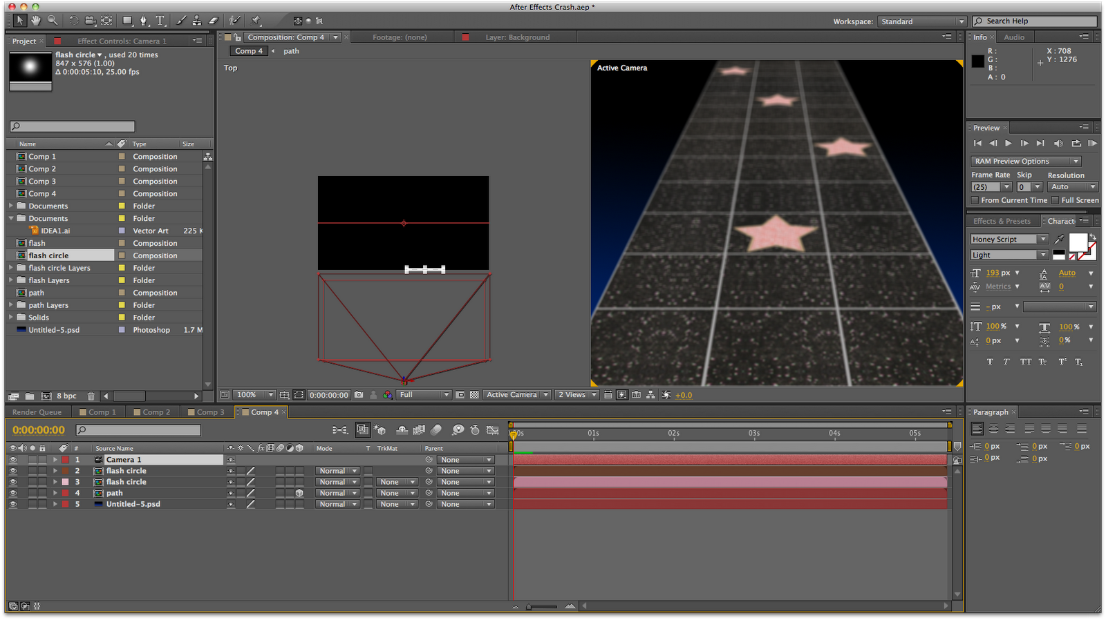
My first ident is based on the Hollywood walk of fame, with the camera panning backwards along the path, before focussing in one one star before the title appears.

As I am an easily confused person, I have colour coded my layers in a way that makes sense to me, pink for objects on the left, brown for objects on the right, and red for the fixed components.


To create this, I prepared my assets in Photoshop, which was the path, using textures from photographs of the Hollywood Stars, and a simple black to blue gradient for the background. These were imported into After Effects, and to get the perspective of the path I altered the X Rotation, once I had enabled 3D. I created the paparazzi flashes using a Photoshop brush, which was imported to AE and the opacity adjusted across 3 frames, to get the quick flash. It was important to use a brush with feather to get that soft edge.
I used Tahoma for the Title, to keep it similar to the style of the star as the Honey Script I have chosen didn't suit. To keep with the style I wanted to use a golden colour for the text, but it clashed too much with the star, so I have gone for black so it stands out.
I have used the MTV logo, like the camera icon seen on the stars, I have even coloured the logo the same as the outline of the star to keep it similar.

Top Ten... Walking Down The Red Carpet

Some of my idents involve the camera travelling down a 'path', this is a camera test to see how this would work in conjunction with other objects that may appear.


Camera and Layer Test from Gemma Byrne on Vimeo.


I want to add in some flashes to symbolise the paparazzi often seen waiting at the side of the red carpet photographing celebrities.

Camera and Layer Test with Flashes from Gemma Byrne on Vimeo.


I used two different brushes from Photoshop and adjusted their opacity over 3 frames: 0%, 100%, 0% to get a flash effect. Clearly the second brush worked better which is a standard brush with feathering.

Saturday, 5 February 2011

Top Ten... Joining Existing Assets

Oscar into MTV from Gemma Byrne on Vimeo.


This could be used in my title sequence. Ideally I would like the Oscar statue to be completely 3D so when that element does it's rotation, the viewer can see it from different angles, at present it is a 2D image transformed in 3D.

Thursday, 3 February 2011

Top Ten... First Assets

These are my assets for my first ident, all of them have been created in Photoshop.

The background is a black that fades into blue to create a night time appearance.


The Hollywood Boulevard - Walk of Fame, was created using a small sample from a photograph, which was then duplicated and transformed/mirrored in Photoshop to get a smooth pattern with no lines etc. The patterns were then pasted into the basic grid I had already drawn out in grey for a pavement feel, with stars dotted on some of the squares. It was created completely 2D although at first I did alter the perspective and then import it into After Effects but this did not work. The canvas I worked on was 9000 pixels long, this is so there would be enough of the layer for the camera to travel down.


The first set of text is Helvetica, to make it look authentic to the stars on the walk of fame, originally they are gold, but the type receded into the background and was not very legible at all.


The MTV logo has been coloured to match the composition.


The second set of text 'Coming Soon' uses the Honey Script which will feature in all of my idents.


Tuesday, 25 January 2011

Top Ten... Crit Feedback Part 2


I agree with these comments, I think if I am clear and concise in my presentation, the subject matter can be communicated easily and instantly. I need to focus on my icons more...

I also need to look at doing my title sequence storyboards. In response to 'Are you naming them all in sequence - (Hollywood stars), I am not sure if I want to include any of them, I would concentrate on the Hollywood aspect for the titles and leave the programme to concentrate on the idols. Also, I don't want to give any clues out, I don't like watching film trailers that practically tell the entire story in 30 seconds.

The visuals were slightly lacking for the crit which explains some of the comments and I completely agree, I need to have the confidence to draw, its only a draft anyway!


Top Ten... Clarification

These are my presentation boards redone to clarify exactly what I set out to do:


Top Ten... Stroke Effect Test

Testing out the stroke effect using Honey Script...

Title Sequence... Stroke Effect from Gemma Byrne on Vimeo.

Monday, 24 January 2011

Top Ten... Storyboards

Quick biro ideas for my idents: (not to timescale)

1) I really like the idea of making a red carpet roll out, I think this would really communicate the Hollywood glamour to my audience. I am not sure how I would go about doing this, however I shall investigate. This could be used as a way of displaying the title, which could unravel with the carpet.


Or the camera panning down the red carpet with the title appearing.


2) An element of Hollywood I would like to incorporate in my ident is the Hollywood Walk of Fame, the camera would pan down the path before zooming in on one of the stars with the title on.


3) The famous Hollywood sign would make an interesting visual point for an ident, I would have to create the setting first with the jagged hills, then placing the text on. I am not sure if I would use the title in Honey Script with Hollywood in the traditional sign, or all in the style of the sign.


4) A true Hollywood icon- the Oscar. This would be in 3D rotating round 360 degrees before zooming in on the plaque with the title on.


5) The title appearing on a director's chair.


6) A clapper board flying into shot, the title would appear on the board, before the board snaps into place ready for 'ACTION'.


7) Not entirely Hollywood related, but some animated film strips would be cool.


8) Again, not just associated with Hollywood, but the countdown you used to see in the cinemas would be a cool asset to add to my sequence, or as part of an ident.


9) Another cool idea would be to have a bucket of popcorn with the title 'popping' out of it.


10) A limousine entering the shot, with the window winding down to reveal the title in a wipe would be a more Hollywood idea.


Thursday, 20 January 2011

Top Ten... Brainstorm Part 2

Associations with Hollywood:

Wednesday, 19 January 2011

Top Ten... Crit Feedback

The first comments I had back from Alice and Starkie, were the suitability of my title as it had become apparent that my title was quite misleading... As the way I am working is very glitzy and glamourous, and not all female icons fit this e.g. Margaret Thatcher, so I must change my title to be more appropriate.

- Top Ten Female Icons of Hollywood...?

The target audience is quite broad too, I need to focus more on this, and from this point on, I am directing this programme at the younger generation of females.


Top Ten... Design Boards For Crit


The last board I drew the ideas in pencil, hence the empty boxes but I will upload this later.

Tuesday, 18 January 2011

Adding Sound To My Existing Compositions... Dissolve

1) Dissolve

This was done as part of a tutorial in adding sound to my compositions.

Adding Sound To My Existing Compositions... Zoom

This was done as part of a tutorial in adding sound to compositions...

1) Zoom:

Zoom with Sound from Gemma Byrne on Vimeo.

Zoom...

For this example, I prepared my asset in Photoshop...


Here is the finished video:

The colours have changed as I have added in a light.

Zoom 13 from Gemma Byrne on Vimeo.