Friday 30 October 2009
No News Is Good News
I chose the headline 'Nothing will ever be the same without our dearest friend Stephen...rest in peace, brother', from The Sun, mainly because of the amount of media coverage the story has had, and some of the mystery surrounding it, which may come across as morbid, but at the time of print, the public were unaware what had killed Gately.
There were a number of ideas within this concept that would be research points:
- The tattoos (that Boyzone have got as a memorial to Stephen).
- Stephen’s husband – Andrew Cowles.
- The remaining band members.
- Funeral.
- The statement read out by Ronan Keating.
- Family and other mourners.
- Stephen’s life.
- The actual cause of death.
- The night of the death.
- Fans’ tributes.
Three ideas that I will take forward and investigate are:
- The remaining band members, especially Ronan Keating’s speech at Palma Airport.
- The funeral, the service in Majorca at a chapel, and a memorial service in London.
- The death and the events leading up to it- what really happened?
To do this the only research methods to get this key information is from the newspapers and internet sites, I did this with an open mind so I wouldn't believe the first story I read. I collected research from a number of sources, The Guardian, The Independent, The Daily Telegraph and The Daily Mail, I simply selected these because they are known for there straight to the point, no nonsense views, unlike The Sun, my original choice of paper, which does and is known for embellishing. I also took information from Wikipedia on the view of Gately's death, again with an even more open mind, as Wikipedia is editable by the public and may hold biased views.
I highlighted key points throughout the documents, and from here I narrowed down the key points even more and put them on to a mind map so cross examination could be done, as some papers shared similar views, while others contrasted completely.
Ready for the next session, we had to note down a statement of fact and a statement of opinion from the research, backed up by supporting evidence;
STATEMENT OF FACT:
Stephen Gately died from a genetic, undiagnosed disease known as pulmonary oedema.
EVIDENCE:
The post mortem results showed that the cause of death was natural (pulmonary oedema), which was paternally inherited.
STATEMENT OF OPINION:
'...our world changed forever when we lost our friend.'
EVIDENCE:
This is from a statement read out by Ronan Keating on behalf of the remaining members of Boyzone, read out atPalma Airport in Majorca.
We were then given the task of picking out 10 adjectives, 10 verbs, 10 objects (hand drawn) and 10 symbols (also hand drawn) which related to our research:
Adjectives: cold, numb, white, happy, sad, beautiful, bubbly, solemn, natural, brightest, heavy.
Verbs: speak, die, cry, carry, promise, pray, smoke, drink, made, change.
Objects (drawn): coffin, church, plane, flowers, star, gravestone, joint
Symbols (drawn): skull and cross bones, gay pride flag...
This exercise helped to kick start the visual thinking process ready to be given the next part of the brief...
Wednesday 28 October 2009
Alphabet Soup...Typeface
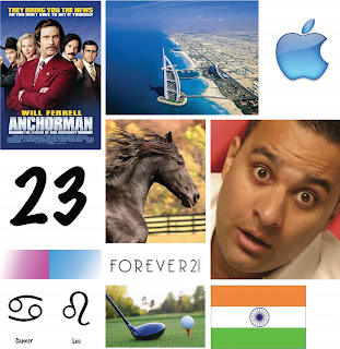
This is what I found out:
SIBLINGS: Younger brother.
BIRTHDAY: July 23rd (Cancer/Leo)
EARLIEST MEMORY: On holiday in France running along, she fell over and cut her leg and went running back to show her Mum.
PERSON YOU ADMIRE: Her Mum- because she manages to do so much.
MOST TREASURED POSSESSION: Mac.
FILM: Anchorman, or comedies and chick flicks.
DESIRED SUPER POWER: Teleportation- to visit friends, family and dog in India and Dubai.
EXTINCT ANIMAL TO BRING BACK: Diplodocus.
MUSIC: Lots, not heavy.
HOBBIES: Golf (joint family activity) and Horse Riding.
FAVOURITE ANIMAL: Dog.
FAVOURITE SHOP: Forever 21.
ACTOR TO STAR IN FILM OF LIFE: Jessica Alba.
DINNER PARTY GUESTS: Russell Peters (comedian).
WHAT MAKES HER UNHAPPY: Bad weather, being cold, being away from family and friends.
FANCY DRESS: Cowgirl.
PHRASE: Go for it!
OTHER INFORMATION: Good cook, Quiet-ish, Half Indian/Half English, Lived in Middle East until last year.
From all this information, I created a mood board to give me a bit of a visual kick start as I was beginning to struggle on what to do. After much pondering I came up with four words to help me down the right path; fun, quiet, girlie, travel.
I thought of manipulating an existing font so that all the bowls were Apple logos, but then I realised it doesn't really say much about Maya. After experimentations with a range of fonts, that were mostly focussing on the word, girlie, I found a font called Afarat IBN Blady, which is an arabic style font. I thought this would be appropriate as using a font like this would be communicating Maya's background, as her home is in Dubai where they speak Arabic.
Maya's name in the font...

At a group crit, I listened to others ideas, and gave input and suggestions on people's work, when I presented my idea the group as a whole felt the letterforms as they are originally, are a bit harsh so I needed to soften them to make it more appropriate to Maya, also they commented on the fact that the letters were a solid black which made them quite bold, something else that wasn't quite apt. However, they did like how I had gone for something completely different, which was comforting as this was out of my comfort zone, and I didn't feel all that confident about my idea.
To manipulate the letterforms were tricky, and I felt like I had gone for something quite challenging so it was fun, but I didn't want to alter the letters too much and lose the whole Arabic feel, so I softened the edges around the letters and adjusted some of the heights. It was at this point that I was beginning to worry about putting logic to the font, as the letters varied in size, height and width so to try and adjust them to a standard height and width would be a) quite traumatising! and b) visually, it would not work. There were a few elements that were the same throughout however.
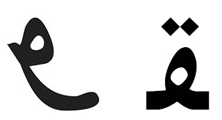
On the right is the original letter E, and on the left shows the manipulated version...
I chose to do a black outline of each letter so it would really emphasise the feminine shapes, i trialled outlines with other colours but the black appeared to work better. After three attempts at tracing the letters onto A1 I finally had a final piece, now I had to make the name badge. For this I just used Maya's first name, and the letters had no fill with a pink and blue stroke, the reason to pick these two as a colour choice are simply that these are Maya's favourite colours. It was quite tricky getting the letterforms to work altogether, because they work much better as individual letters rather than joined. I wanted to join each letter up so it still looked like Arabic script but the text wasn't very legible especially as the 'Y' is a strange letter anyway. In the end I did much prefer the badge, it was lighter and certainly brighter and I felt it communicated Maya (below).
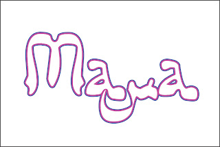 To me, the first 'A' and the 'Y' vaguely represent a smiley face, the bowl of the 'A' could be an eye, and the descender of the'Y' could be a smile. This isn't that noticeable but is still representative of Maya.
When it came to presenting my work, I did struggle due to a persistent, annoying tickly cough which made it hard to talk, but I think people knew roughly what I was trying to get at. Other than that, I think I did okay.
Sunday 25 October 2009
Visual Language... Ident
We chose the letter F as it is quite a simple letter with no diagonals or rounded sections, but we would add serifs on for added effect. Black card would be attached to the boxes, and the black card is what would make the shape of the letter. Where edges of the boxes met, some of the black card had to be cut in half, this is strange to describe in words, but makes sense once seen. We had a wide selection of boxes to work with from cigarette packets to cereal boxes.
The group worked well together, Ellis and Charlotte were at the view point instructing where to put the card, while Polly, Robyn and I were cutting up and placing the card on to the boxes.
These are a selection of photos taken by Ellis/Charlotte throughout:
Wednesday 14 October 2009
Visual Language Exercise Continued
Some of the words we were given were taken from the Alphabet Soup brief of when an alphabet had to be created to represent, duplicate, compress, dissect, hybrid and edit. We were then asked to create single squares to represent the word, which is what we did last week.
Duplicate: For the first square, there was one A, then the next square there were 2, for the third there was 4 and for the last square there was 8, so as a sequence I think they communicated the idea of duplication.

For the individual representation I combined all 4 squares into one, with an extra line at the bottom.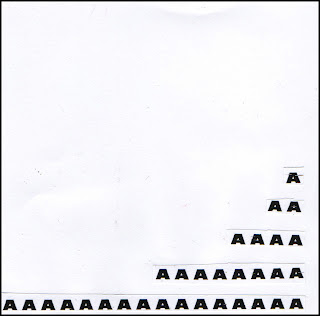
Compress: I found this quite tricky at first but decided to use2 lines of 4 bold A’s for the starting square, in the next square, the top line was still the same but the bottom line wasn’t bold, for the third one the bottom line of A’s were in a smaller font, and finally, the bottom line was smaller still. I think this showed the idea of the heavy, bold A’s compressing the other A’s so they progressively became smaller and smaller in size.
For the single square example I had 3 rows of 2 Bold A’s with some smaller Bold A’s underneath in 3 rows of 3 which slightly overlap to show the idea of compression and being squashed.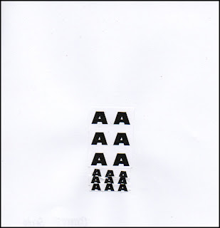
Dissect: This was another tricky one, as one of the rules set was that the letters could not be cut into, which would be ideal for this word. Instead, I cut out 4 rows of 4 A’s and stuck them down for the first square, for the next one, it was the same arrangement but the letters had been cut into individual columns. For the third example the 4x4 arrangement was the same but the letters have been cut even further into blocks of 2, and finally for the last square all of the A’s had been cut into individual letters.
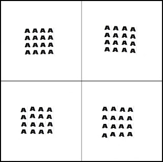
In the single example I had two rows of 4 A’s that have been placed at a 45 degree to each other, to show how they have been cut up.
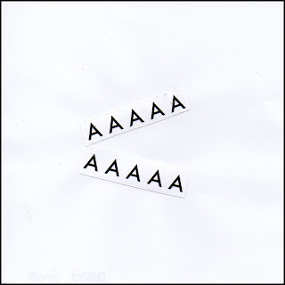
Hybrid: In the next series, I added a new font in each square, so for the first one, there was only one font, in the second there were two, in the third there were three and in the last sample, 4. This was to show how a hybrid is made up of different things. The way in which the letters were arranged were the same on each but bundled together at different angles, to show how the different fonts are part of one unit.
For the singular version, I feel this was probably my weakest representation, as it was the same four fonts used in the series, with one letter from each stuck in a line, again to show that the letters are part of one unit.
Edit: Some people found this quite tricky, however I found it was quite straight forward, as to edit something generally is to change or amend. So I started off with a letter A in the bottom left corner and then in the second example, the A was smaller in size and had been rotated 90 degrees clockwise and placed in the bottom right hand corner, for the third square the A is bold and standing upright in the top right corner. In the final square, the A is in the top left corner and has been rotated 180 degrees and is smaller than the previous one.
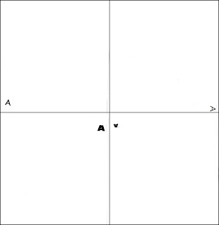
In the last single example, I have used 4 A’s, the first one is stood upright, the second is smaller and has been rotated 90 degrees clockwise, the third letter had been rotated a further 90 degrees and is bigger in size. The final letter has been rotated another 90 degrees and smaller.
Again, I found the exercise quite interesting as it really gets you to 'think outside the box'. I did find it challenging but that made it all the more intriguing, and again, it is great to see how the same information is interpretted differently by other people.
Sunday 11 October 2009
Visual Language Exercise
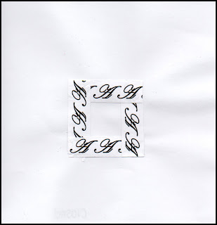
Closed: For this word, I cut out 4 strips of 3 A’s and formed a square in the centre of the page with the strips overlapping; this is to give the feeling of something being closed in.
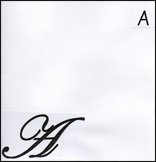
Difference: In this example, I decided the most obvious way to represent this was to have 2 A’s that were different in size, e.g. large and small and different in style, e.g. script and sans serif.
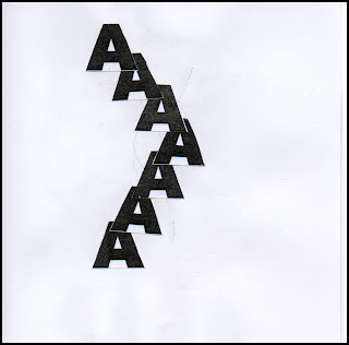
Link: To create the idea of links, I decided to overlap the A’s to show how they cross over to form individual links.
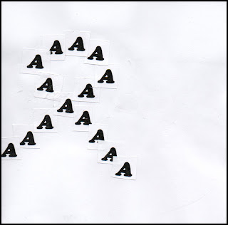
Loop: Here, I created a loop out of the A’s, with a slight overlap at the loop to show it did cross over.
Space: My representation for space, is very obvious, a small A in the corner of the page.
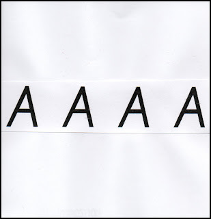
Horizontal: This is probably the most obvious out of the series, it was simply four A’s laid horizontally across the page.
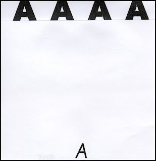
Above: This was quite simply a small A at the bottom middle of the page, with four bolder A’s directly above it, the reason for the difference in size was to show the A at the bottom was a long way below the A.
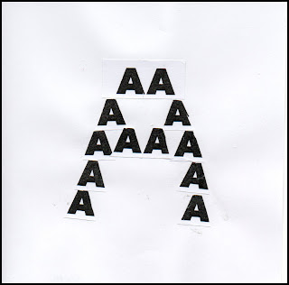
Form: For this one I decided to do the shape of an A, which I felt would be the most appropriate, although I was unsure if I was communicating the right idea.
Positive: I first thought of a graph and positive correlation, totally forgetting of the symbol for positive, a plus sign, which is what I ended up doing for this one.
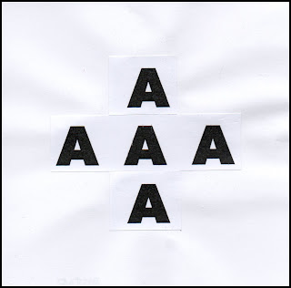
Finish: I wasn’t sure what to do for this one initially, the first image that came into my head was a black and white chequered flag, but as the type was black and background was white, I thought this may be tricky to do, so I thought of an actual finish line.
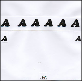
After we had created these representations, we sat in front of other people’s examples to see if we could guess the word that was being presented, for the person’s I looked at, I got 6 out of 10, but the person that sat in front of mine got 10 out of 10, so I think that shows that I successfully represented each of the words. Although, for me personally, I think a few of my examples were a bit weak, although I maybe could have achieved 10 out of 10 through process of elimination.
Friday 2 October 2009
Alphabet Soup
I sketched different ways in which I could exaggerate, for example, I could exaggerate the lines used to create the letterform, or exaggerate a specific part of the letter, such as the bowl or stem, I also thought about pixelating the letterforms which would be anohter method of exaggeration. Another sketch I did was a letter E drawn in one point perspective with a vanishing point. I did quite like this but I decided to really show exaggeration, I needed to work in 3D.
I then had to choose a font which at first was going to be something plain and sans serif and easily manipulated like Helvetica, however I found a font called "Exaggerate" and the letters look like they are facing sideways, which I found appropriate.
Now I had found my font I originally settled with exaggerating the depth of each letter, I wanted to achieve this through decoupage, however once I had presented this idea in a group crit, a few members of the group thought that my idea didn't communicate this and it looked like I was trying to communicate 'Layers', one of the other words. I completely agreed with this and decided to do something similar but instead of having 4 or 5 letters stacked on top of each other separated with foam squares, I would have a piece of black card, with a letter stuck on with 2 foam squares to raise it up, another letter stuck on top of that with the same amount of foam sqaures with one section of the letter more raised than the other.
By using the black card, I could use a coloured card for the letterforms, which would make quite a dramatic contrast and the colours would appear more vivid, than on white card. Also I used different coloured card to make the idea seem bright and interesting, so it wasnt just letterforms stuck to black card.
For my 10 letterforms, I chose to spell out Exaggerate, just to be even more explanatory, and to avoid any confusion.
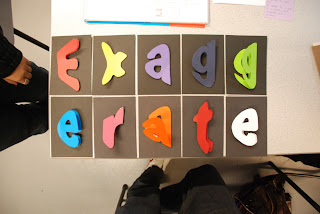
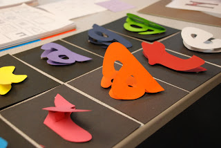
With these letters we were then asked to pick our favourite for the Digital side of the brief...


