Open publication - Free publishing
Showing posts with label Brief 1 - Mexican Museum. Show all posts
Showing posts with label Brief 1 - Mexican Museum. Show all posts
Tuesday, 13 December 2011
Brief 1 Boards + Evaluation
This brief allowed me to investigate a wide range of different graphics areas, but still concentrating on promotion, part of my rationale.
The Bloc+Blur brief wasn't the most exciting brief I had worked on, as I really wanted to put my creative stamp on it, but due to the large restrictions it was more about layout, which is still part of my rationale, so in this respect I had fun experimenting with different layouts.
The Fatboy Slim brief was fun, I am really pleased with the outcome, and the concept, I think its quite powerful, it has had some good feedback from peers too which is always good to hear. This saw me working in a CD cover size, and again I experimented with layouts.
The Manchester Book Fair Brief got very confusing, originally the brief was supposed to be a hotdog fold book with the rejected Mexican Museum of Design briefs ideas, then it became a book of patterns, before finally being a set of affordable notebooks. Due to all the changes the books didn't end up going to Manchester.
The D&AD brief was a quick turnaround brief for the North Lecture, this was a brief that really appealed to me as it was about experimenting with layout, and I am really pleased with the final poster, I think it is portfolio worthy.
Thursday, 13 October 2011
Another Idea in the Equation...

Another idea to think about... Now I really am stuck. I do really like this idea, it has the balance of one of the first idea on the previous blog post, and the clearness and clarity of the second one.
I have less than 24 hours to pick one.
Print slot: 2pm.
Mini Informal Crit
As I am coming up to both my Brief 1 and Manchester Book Fair deadline, I need to select my final pieces. I am not comfortable with the quality or content for my book for Manchester, so I will be submitting one of my Mexico prints.
Jonathan Finch and Steph Bourne both preferred:

Although Steph felt, the opacity should be adjusted so it is more opaque.
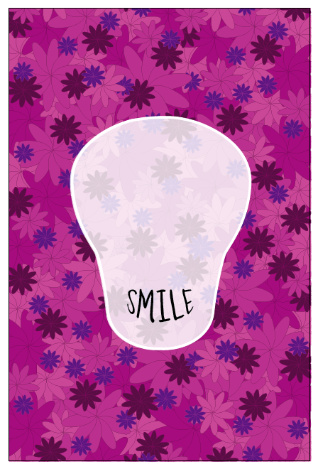
Naomi Farrar and Rob Green both preferred this one:

I am torn between the two, after a chat with Rosalind I became even more torn, with the first one, the type is even and so in terms of the image it works well, but with the second one I quite like how the word Smile stands out but in terms of hierarchy I see Smile then the rest of the text which isn't what is intended. Kim Sandford and Hazel Gage also liked the top idea better, I have decided to pick the first one.
After looking through the earlier designs for the skulls Rob commented that I shouldn't let the skulls go to waste, maybe I could use one as a tag to go with the poster?
Jonathan Finch and Steph Bourne both preferred:

Although Steph felt, the opacity should be adjusted so it is more opaque.
Naomi Farrar and Rob Green both preferred this one:

I am torn between the two, after a chat with Rosalind I became even more torn, with the first one, the type is even and so in terms of the image it works well, but with the second one I quite like how the word Smile stands out but in terms of hierarchy I see Smile then the rest of the text which isn't what is intended. Kim Sandford and Hazel Gage also liked the top idea better, I have decided to pick the first one.
After looking through the earlier designs for the skulls Rob commented that I shouldn't let the skulls go to waste, maybe I could use one as a tag to go with the poster?
Wednesday, 12 October 2011
Typographic Eyes
Just an idea I started drawing:


Computer version:

Using the words To Death With A to form an eye using the warp tool on illustrator.
 The A looks quite odd here, it may look better on the same line as with, to give it a more rounded smoother edge.
 This actually looks really weird, and slightly, I know simple designs can work well, but this is too plain.
 This looks much better, and works better as a shape for an eye-socket.
I have used the repetition of 'Smile' to represent teeth. I think it looks quite effective along with the eyes, as both have two lines of text.
I am not sure if the 'Smile' works better in this one. It is easier to read, and gets the point across.

Just another idea - I will definitely be sticking with the full line of text 'To death...'. Here I have adjusted the opacity, I have put it up to 90% as a peer suggested it may look better.


Computer version:
Using the words To Death With A to form an eye using the warp tool on illustrator.


I have used the repetition of 'Smile' to represent teeth. I think it looks quite effective along with the eyes, as both have two lines of text.
I am not sure if the 'Smile' works better in this one. It is easier to read, and gets the point across.
Just another idea - I will definitely be sticking with the full line of text 'To death...'. Here I have adjusted the opacity, I have put it up to 90% as a peer suggested it may look better.


Ideas


Colour Experiments:


Re-reading the brief
Its coming up to my last few days before I send my work off to Mexico! Very exciting. Just need to re-read the 8 or so page brief and double check a few things.
In the envelope:
- DVD/ CD containing the JPEGs of my final poster.
(Poster must be RGB, a minimum of 200 dpi and less than 25mb and named byrne_gemma.jpg)
- Registry sheet - filled in and signed
- Brief copy - with every page signed
- Photocopy of my identification
- Both authorisation forms filled in.
Wow.
Note to self: Information from John!
Airmail 3-7 working days £4.25 up to 2 kilos
AirSure 2-6 working days from £5.98
International signed for 3-7 working days £4.95 plus post weight
60cm x 90 cm
Rather a strange set of dimensions, 60cm x 90cm. This means a bit of altering for my pattern.
 With the above pattern there is some strange 'bald' patch on the left above the middle...
 Before clipping mask.

Final pattern.


Final pattern.
Type
I really want to include the title 'To death with a smile' to my work, it is appropriate to show what this is about - a positive representation of death, more of a celebration of life. I like the idea of warping the type into a smile - which will go in place of the skulls mouth.


 The two lines of text don't seem to work best for the mouth shape...
Do I write 'To death with a...' or 'To death with a smile' - is this too obvious?
The two lines of text don't seem to work best for the mouth shape...
Do I write 'To death with a...' or 'To death with a smile' - is this too obvious?


Tuesday, 11 October 2011
Things Took A Different Turn
I sat back and reflected on my ideas today... I just thought, how obvious. So I dived into something new, without much thought really. Looking at my Day of the Dead-esque masks, they are not a patch on the Mexicans', why send them a piece of work like that? The skull in this idea is not quite as 'in your face' as my other attempts. And I really wanted to include the text 'to death with a smile'. I have kept the ideas of flowers to keep the positive, happy and peaceful vibe I am intending to create.


This is totally different from any work I have done before. I think I like it :)


This is totally different from any work I have done before. I think I like it :)
Creating Patterns
Patterns to be used with my skulls, although this will also inform the books for my Manchester Book Fair Brief...
I will be creating them from the basic flower shapes I used for the skulls...
Pattern 1:


Pattern 2:


Pattern 3:


Subscribe to:
Posts (Atom)