Showing posts with label Type. Show all posts

Friday, 4 November 2011

Font Choices

First choice for type, something sketchy/art looking...


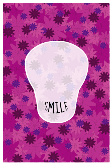
After reviewing this selection I decided my first message of communication for my logo isn't about the art, the most important thing to me is that the logo has a friendly/informal/relaxing air about it. Something too arty/sketchy might come across child like. Serendipity is a place to cheer people up, not all of the art works will be for everybody.


The next set of fonts I looked at started off very simple, sans serif, and as the list progresses they become more hand-written, some script some not. I think the handwritten approach seems friendly.


I do like pretty much all of these choices, but what I have to be careful about is the script fonts as they may portray a more feminine look - I have to make the logo appeal to as many people as possible. Based on this, I need to narrow down a list and begin developing ideas. Some of the fonts I think the type on its own could work as a logo!

Wednesday, 12 October 2011

Typographic Eyes

Just an idea I started drawing:


Computer version:

Using the words To Death With A to form an eye using the warp tool on illustrator.

The A looks quite odd here, it may look better on the same line as with, to give it a more rounded smoother edge.

This actually looks really weird, and slightly, I know simple designs can work well, but this is too plain.
This looks much better, and works better as a shape for an eye-socket.


I have used the repetition of 'Smile' to represent teeth. I think it looks quite effective along with the eyes, as both have two lines of text.


I am not sure if the 'Smile' works better in this one. It is easier to read, and gets the point across.


Just another idea - I will definitely be sticking with the full line of text 'To death...'. Here I have adjusted the opacity, I have put it up to 90% as a peer suggested it may look better.

Type

I really want to include the title 'To death with a smile' to my work, it is appropriate to show what this is about - a positive representation of death, more of a celebration of life. I like the idea of warping the type into a smile - which will go in place of the skulls mouth.
The two lines of text don't seem to work best for the mouth shape... Do I write 'To death with a...' or 'To death with a smile' - is this too obvious?