Reached my Vimeo limit so had to use Youtube!
Test Trailer 1:
After feeling happy with how the images interacted with each other, I placed the ITV logo on and added in the tagline 'Who's watching you?' which stalks towards the viewer in the same jittery CCTV style as the images.
Test Trailer 2:
In this idea I added in the eye from Google Images after the text, which fades in with the text Eye Spy in the pupil, it fades out and the day and time is added underneath in the same jittery effect.
Test Trailer 3:
The interaction between the words Eye Spy and the eye is different, here the eye stays on screen for longer and the words Eye Spy fade in at 100% and decrease to about 40% moving towards the pupil. The reason for using this eye, is because it is in black and white and the eye itself is in colour which is very captivating.
Test Trailer 4:
I am quite excited about this idea, where the words Eye Spy move towards the pupil in the previous one, this is still the case, but the eye ripples as the words appear to hit the eye.
Test Trailer 5:
Additional sound on ripple!
Note: You need decent speakers to hear this.
I am even more excited about this idea, the sound gives it much more impact! I was searching for impact and thud sounds for an hour before I found this! I now feel like an expert in different kinds of impact sounds.
And now with 'Massive Attack - Teardrop' - which appears on the part the opposite of a teardrop!
This made my hairs stand up when I watched this - I think the song works well with the clip, and its ironic the song is called Teardrop when my idea is centred around an eye. It also happens to be one of my favourite songs of all time.
Wednesday, 30 November 2011
Test Compositions 2
Here I have used an opacity fade e.g. First image opacity 100% to 0% while the next image fades in from 0% to 100%, over the fast and last images, and a preset called Bad TV over the first and last images, these together give the impression of it being an actual film.
I have now used the opacity fade over all the images.
After speaking to Lorraine, she suggested not to use the opacity change, as it is too smooth, CCTV should be quite erratic.
I have shortened the sequence so it moves faster.
I found a really good static sound, that isn't too much but it just buzzes in the background to give the motion a bit of authenticity.
Test Compositions
This does not look like CCTV footage - it needs much more work. I edited the hue and adjusted the wave speed once from Bad Tv preset.
This looks a little bit more like CCTV, I adjusted the wave speed at 3 places to give a more distorted effect. The animation seems quite hesitant, even though I made 5 adjustments of wave speed. This looks less like CCTV than the previous one.
This works better, I changed the existing adjustments of wave speed, the clip now fades in from 0% opacity to 100%.
The only thing I have adjusted here is the noise - I have increased it to make the image more bitty.
Ideas for Ident
The ident has to be simple, my target audience don't care what the ident looks like, as quoted by one of my respondents 'The Channel 4 ident is fantastic, but it doesn't make me watch it.'
So no explosions or fireworks! Damn.


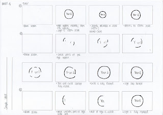

So no explosions or fireworks! Damn.


Tuesday, 29 November 2011
Testing the Menu
Using a picture of a programme that might feature on my channel, Grand Designs:


This is beginning to look more authentic, however, I need to change the black type.

 This is with the opacity adjusted, this looks much more refined. I need to change the logo to the right hand side as specified in the branding guidelines.

I just tried to reverse the colours, however, this does not work anywhere near as well.

This is with 80% opacity, it looks much better as the blue isn't too harsh, and it doesn't distract from the programme too much.


This is beginning to look more authentic, however, I need to change the black type.

This version is much better, the colours work well here.


I just tried to reverse the colours, however, this does not work anywhere near as well.

This is with 80% opacity, it looks much better as the blue isn't too harsh, and it doesn't distract from the programme too much.

This is with the same opacity but a different alignment. This will be my final menu.
Menu
The menu has been quite easy to design, the colours are fixed, blue and white/black, and the font choices are fixed. It is just a case of applying the branding, to some kind of rectangular shape across the bottom of the TV screen.


Pre-Launch Screen
Ideas for my static pre-launch screen:
These are my first ideas and my least favourite, as my design develops I like it more. The last two examples would be good to be shown on screen a month before the launch, without the repetition of the word nature!
These ideas are much more suitable and in keeping with the branding. Reviewing these ones, for the screen which will display the channel numbers, Cooper Black in the Your 4 blue will be most suitable.
Black looks too harsh and distracting from the logo.
Final Two:
The first one will be displayed on the channel's frequency a month before the launch, the second with the channel's numbers on (for reassurance) will be displayed a fortnight before the launch.


These are my first ideas and my least favourite, as my design develops I like it more. The last two examples would be good to be shown on screen a month before the launch, without the repetition of the word nature!
Black looks too harsh and distracting from the logo.


Assett: Remote Control
Photoshopping an existing remote.

Then it didn't look good at all.

These two don't even look like remotes.

Logo is out of place, but slowly getting there.
 A little more of an improvement.


Then it didn't look good at all.

These two don't even look like remotes.

Logo is out of place, but slowly getting there.


Looking better.


Further Logo Ideas
Open publication - Free publishing - More design
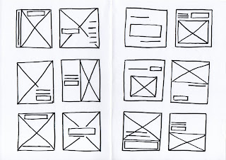
Page 1 + 2:
Using the Channel 4 Pantone Pallete, experimenting with different strokes and fill.
Page 3:
An accident that seemed quite interesting - although not suitable for this brief.
Page 4: Eliminating the colours already associated with other channels.
Page 1 + 2:
Using the Channel 4 Pantone Pallete, experimenting with different strokes and fill.
Page 3:
An accident that seemed quite interesting - although not suitable for this brief.
Page 4: Eliminating the colours already associated with other channels.
Digital Onscreen Graphic


As my logo is going to be colourful I don't think there will be any need to have a DOG, as it just looks like an annoying price tag. The research too shows its annoying, and can be distracting.
More Logo Ideas
Taking into account the PDF I found and my logo research about targeting older people:
(http://g-byrne0912-dc.blogspot.com/2011/11/colours-for-my-target-audience.html)
- Avoid seriffed fonts
- Do not use condensed fonts.
- Light colours e.g. white on a darker background can be easier for a partially sighted/older person to read.
- Use high colour brightness
- Simplicity is key, no fancy shapes, fonts, colour combinations.
My logo needs to be clear and not easy to confuse with other channels, or have any associations. For example, my orange and white logo can be completely written off now, as when I trialled it on a square I thought Easyjet. The other channels belonging to 4 use red (Film Four), purple (e4), green, (more 4) and
(http://g-byrne0912-dc.blogspot.com/2011/11/colours-for-my-target-audience.html)
- Avoid seriffed fonts
- Do not use condensed fonts.
- Light colours e.g. white on a darker background can be easier for a partially sighted/older person to read.
- Use high colour brightness
- Simplicity is key, no fancy shapes, fonts, colour combinations.
Open publication - Free publishing - More design
Page 1: More colour trials for my logo - I love the deep purples but they are too similar to the e4 colour. I think the deep pink works too but that might be too feminine.
Page 2 + 3: Trialling different shapes, I chose the circle as its simple and quite friendly, with no sharp corners.
Page 1: More colour trials for my logo - I love the deep purples but they are too similar to the e4 colour. I think the deep pink works too but that might be too feminine.
Page 2 + 3: Trialling different shapes, I chose the circle as its simple and quite friendly, with no sharp corners.
My logo needs to be clear and not easy to confuse with other channels, or have any associations. For example, my orange and white logo can be completely written off now, as when I trialled it on a square I thought Easyjet. The other channels belonging to 4 use red (Film Four), purple (e4), green, (more 4) and
Monday, 28 November 2011
Logo Ideas

Looking at some of these ideas I have clearly not thought about my target audience. The type must be clear, and sans serif.

These ideas are much clearer, and I think having the name inside a plain shape will increase the audience's ability to recognise it, especially on screen when the logo may be placed over the top of a programme or image, it has to be distinguishable.
Potential Names Updated
New additions after crit feedback:
4Choice
Select4
Screen4 - maybe too cinematic!
4Vision - too similar to BT Vision, or an opticians!
Your4 - final choice.
Your4 seems like a suitable name, it fits in with the Channel 4 portfolio, E4, More4, Film4, and it suggests this channel is just for over 60s making it seem more exclusive, as I have found in my research there aren't any channels that target this one audience which means channel flicking, this one channel will contain all the programmes my audience needs.
Sunday, 27 November 2011
Initial Logo Ideas
Logo Ideas for 4Leisure:

After I looked back at these, I realised I wasn't entirely happy with the name. Back to the drawing board...

After I looked back at these, I realised I wasn't entirely happy with the name. Back to the drawing board...
Saturday, 26 November 2011
Potential Names
Potential names for my new channel:
Refine4
Mature4 - maybe too ageist!
First4
4Classic - suggests old programmes!
Quality4
Grade4 - sandpaper!
4Degrees - boy band!
Felicity4
Flick4
4Value - cheap sounding
Senior4 - no.
Fresh4 - sounds like a music channel!
Becoming4
4Leisure - sport sounding, although originally I thought of over 60s having more leisure time.
Contemporary4
4Refined
I quite like 4 Leisure at the moment...
Update: 28/11/2011
New additions after crit feedback:
4Choice
Select4
Screen4 - maybe too cinematic!
4Vision - too similar to BT Vision, or an opticians!
Your4 - final choice.
Your4 seems like a suitable name, it fits in with the Channel 4 portfolio, E4, More4, Film4, and it suggests this channel is just for over 60s making it seem more exclusive, as I have found in my research there aren't any channels that target this one audience which means channel flicking, this one channel will contain all the programmes my audience needs.
Friday, 25 November 2011
Potential Names
Potential names for my new channel:
Refine4
Mature4 - maybe too ageist!
First4
4Classic - suggests old programmes!
Quality4
Grade4 - sandpaper!
4Degrees - boy band!
Felicity4
Flick4
4Value - cheap sounding
Senior4 - no.
Fresh4 - sounds like a music channel!
Becoming4
4Leisure - sport sounding, although originally I thought of over 60s having more leisure time.
Contemporary4
4Refined
I quite like 4 Leisure at the moment...
Associations with my target audience

Monday, 21 November 2011
Ministry of Sound Brief
Due to the many projects I have going on at the minute, I have decided to terminate this brief for this module
Friday, 18 November 2011
Interim Evaluation

Feedback from Joe and Lorenzo
I presented my Fatboy Slim ideas to Joe as I was wanting some advice, Joe liked the concept, but felt it could be pushed much further, and offered suggestions on where it could go, e.g. omitting the Fatboy Slim logo. And edit the code to incorporate the album title and having the QR code filling the entire space. Although I am concerned this will effect the functionality of the QR code and I like the fact that it currently works!
The crit with Lorenzo was very motivating and I have once again found excitement for what I am doing! I need to widen my deliverables, in terms of quality, not just plonking posters here and there but I need to consider what exists in the physical space.
And my work placement at Urban Feather is definitely going ahead next week, great end to a rubbish week!
Thursday, 17 November 2011
Variations
Open publication - Free publishing
Open publication - Free publishing
Open publication - Free publishing
Wednesday, 16 November 2011
Brief 1 - Ministry of Sound
This seems like an exciting but quick turnaround brief! The target audience is aimed at people my age, and I would definitely say I am a fan of the Ministry of Sound nightclub.
*Upload scan in of brief*
*Upload scan in of brief*
Fatboy Slim Ideas
These are my first set of ideas:
The iPhone ideas were the very first thing that came into my head, thinking of the idea of technology and how far it's come, although it doesn't look great. Then I thought of how far the Internet has come and created a Fatboy Slim 'search engine' - again, not very striking, and something didn't feel right...
The train ticket idea was me thinking about travel. I'd love a train ticket that looked like this!
However, not very strong ideas, on to the next ideas...
This idea came to me when I used a bar code font on Brief 2, I suddenly thought how cool would it be to have the album cover as a QR code and when you scanned it, it took you to the website, which by the way...it does! Until I edited it, and it became temperamental, but the first few do, try it!!
Fatboy Slim Font
I thought to start with the font for the album title should be a sans serif so the type isn't too over complicated, has an informal tone and the focus can be on the logo and the image (if any).
 After looking at the above fonts, I realised they were still quite formal and text book looking, it wasn't until the last two that I decided to look for a Fatboy Slim style font, that way it keeps the design more consistent.


Jackpot!
Fatboy Slim Layout Variations
'You've Come A Long Way, Baby'
This made me think of two things: travel and technology.
I decided to use these two subjects as a starting point for ideas...
Here are some layout variations, based on existing album covers from Fatboy Slim and other artists, and some purely made up:


This made me think of two things: travel and technology.
I decided to use these two subjects as a starting point for ideas...
Here are some layout variations, based on existing album covers from Fatboy Slim and other artists, and some purely made up:


Useful Motion Tutorials
Tutorial I used for last year's work - to make a handwriting effect
Showing particles moving:
Not had a go but this looks cool:
Tuesday, 15 November 2011
Poster Layouts
More layouts for the poster for Serendipity... I am still not 100% with these ideas, I think I may have to have a break from this brief and come back to it later.
Exhibition Postcard Front Variations
Open publication - Free publishing - More design
The last 8 designs show development of my final design for the front of the Cynosure postcard.
The last 8 designs show development of my final design for the front of the Cynosure postcard.
Bookmark Variations
Another avenue of raising awareness, bookmarks to be distributed throughout the wards for patients.
New Gallery Poster Variations
Originally I started with an A3 format, but realised this is a typical size for the NHS, I want the poster to stand out from all of the other posters around the hospital.
This next batch are A3 width (420mm) but 297mm high.
I think the text reads better in this format, I do want some white space to enhance the 'transforming the white space in a ward near you', but I think the original set had too much white space so the elements were lost.
Monday, 14 November 2011
Stationery Variations
Saturday, 12 November 2011


Fatboy Slim - 12 Initial Ideas
I first thought of travel and technology - they have come a long way, then I thought of a few funny scenarios of it being about the man on the original cover and how far he's come, one where he is on a 2p coin, and one where he is the president:


I would like to focus on the technological aspect, it will update the cover design, and hey! we are in the twenty first century where technology is moving just as fast as this module is going!!
Friday, 11 November 2011


Subscribe to:
Posts (Atom)