From women...
To men:
- Your hair is looking great today.
- That's a really nice gesture, thankyou.
- What a brilliant idea.
- That shirt looks great on you.
To women:
- That dress is lovely, where's it from?
- That eyeshadow really brings out the colour in your eyes.
- Your children are so well behaved.
- What a warm, inviting home you live in.
- Thankyou, you are such a thoughtful friend.
From men:
To men:
- That's a fantastic set of wheels you have.
- You and your partner are really well suited, he/she is great.
- Your hard work has really paid off.
- That jacket is cool.
- You are amazing on the guitar.
To women:
- You look absolutely stunning.
-
Wednesday, 24 March 2010
Communication Is A Virus... There's An App For That
This would be the template for the App button. I have stayed with the purple colour scheme to keep the design consistent and uniform. I think the button should be to do with the design for the book, relating to the male and female symbols, however, to emphasise the idea of talking, a speech bubble may be an appropriate shape to consider. I created this using a tutorial that specifically tells you how to create an iPhone App button, taken from this site http://www.sitepoint.com/blogs/2009/06/29/how-to-draw-an-iphone-icon-in-illustrator/.
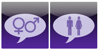
These could be buttons for if the App is going to be unisex, here, I have combined the symbols for both genders and a speech bubble, I feel this is an appropriate and simple design that could work well.
As for the interface of the app it needs to be familiar, an overstyled app is going to need instructions, people nowadays don't have time for this, they want something they immediately understand. So the app should visually be very similar to existing ones, no majorly fancy design work, something that simply communicates what needs to be seen.
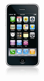
This is potentially how the button may look in it's place on an iPhone, I have not put the text on as it is not crucial at this stage:
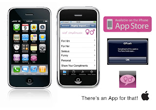
This is a design board I have put together to show how the app will look, Meryem designed the menus for the app and I did the icon/logo plus the compliment on the iPhone.
![]()
The button must be simple, after reading an article on this web page http://www.smashingmagazine.com/2009/07/21/iphone-apps-design-mistakes-overblown-visuals/ the key, as always is simplicity, so a visually appealing yet simplistic design is what will be required for this. An image that says exactly what the app is about.
This could be a design for a male version and female version, which would feature compliments for women to say to men and women, and a male version for men to say to men and women. This could be an interesting idea, as if the app was to be unisex, it is important not to make the compliments too feminine to protect 'male pride'.
e.g.
Male App
Male compliment- That's a cool t-shirt you're wearing.
Female compliment- You look stunning in that dress.
Female App
Female compliment- I love that top, where is it from?
Male compliment- Your hair is looking really good today.
Instead of creating two apps- male and female, it could just be the button that is gender specific, as a gimmick, and the interface could give a selection of categories for who the compliment is for and what the occasion is.

These could be buttons for if the App is going to be unisex, here, I have combined the symbols for both genders and a speech bubble, I feel this is an appropriate and simple design that could work well.
As for the interface of the app it needs to be familiar, an overstyled app is going to need instructions, people nowadays don't have time for this, they want something they immediately understand. So the app should visually be very similar to existing ones, no majorly fancy design work, something that simply communicates what needs to be seen.
This is potentially how the button may look in it's place on an iPhone, I have not put the text on as it is not crucial at this stage:

As the colours for the screen print did not come out as intended, I recoloured the icon to create the finished piece, whilst Meryem designed the app itself. The type added on is Helvetica.

This is a design board I have put together to show how the app will look, Meryem designed the menus for the app and I did the icon/logo plus the compliment on the iPhone.

Friday, 19 March 2010


Thursday, 18 March 2010
Communication Is A Virus Brief
This brief is a collaborative project which requires a graphic response aimed to a specific target audience. As with all briefs, the tone of voice must be appropriate to the content and the audience, and it must remain LEGAL. Considerations will include, the use of type or image or both together. The purpose is a large consideration, is the product informing, entertaining, directing etc. However, the colour pallet is limited to two colours plus stock.
To work out how to be matched up with the ideal working partner we had to work out what our skills and attributes were to identify what we were looking for in that partner.
MY SKILLS:
- Good with type.
- Good at layout.
- Photoshop.
- Negotiation.
- Concept building.
MY PERSONAL ATTRIBUTES:
- Positive.
- Focussed.
- Punctual.
- Determined.
- Can communicate.
THEIR SKILLS:
- Someone who's good with image (and possibly type).
- Someone who's good at practical things- drawing, crafting.
- Good at concept building and coming up with ideas.
- Can use Illustrator (possibly InDesign too).
- Good at presentation.
THEIR PERSONAL ATTRIBUTES:
- Good timekeeper- punctual.
- Not easily distracted.
- Confident...not arrogant!
- Positive.
- Able to communciate/present/pitch
+ NICE :)
We then had 45 minutes to create a visual advert showing these skills and attributes, in A3 format, these were to be posted on the wall of Studio 3, and people whose skills matched that of my poster could write their name on a post it note and place it on my poster. I did the same for the others.
In the end, Meryem and I have chosen to investigate "Get people to communicate/talk more".
We decided to go away and research on this and bring it all together to come up with a concept.
My research was looking at the world of Facebook and social networking sites, including the horrors of what goes on online for example, paedophilia, but also I looked into how it brings people together.
Meryem had looked into languages particularly saying 'Hello' in different languages, based on the ideas of people not saying what they would like to.
Tuesday, 9 March 2010
What Is A Line...Brief
The Brief:
' A formation of people, objects, things on or besides each other.'
Considerations:
- Photography
- book?
- binding?
- fold-out?
- stock?
- CD?
- postcards
Target Audience:
Due to the subject and nature of the brief, I feel this would appeal to people interested in art and photography.
Tone of Voice:
Serious, informative.
Background:
Mandatory Requirements:
A body of visual research, in notebooks, journals etc. organised in a rational appropriate way.
Wednesday, 3 March 2010
In Design Preparation
My partner for the Indesign brief is Elliot, we interviewed each other to try and get some information ready for creating our double page spread publications. The document must feature 300 words and 2 appropriate images.
Here are the questions we asked, and Elliots answers...
Home is called...
- Worcester
Age:
- 19
Favourite Animals:
- Dog
- Tiger Cub
- Seal
- Penguin
- Reindeer
Favourite Film:
- Skateboard
- Dog
- Elliot
- Elliot's work
Here are the questions we asked, and Elliots answers...
Home is called...
- Worcester
Age:
- 19
Favourite Animals:
- Dog
- Tiger Cub
- Seal
- Penguin
- Reindeer
Favourite Film:
Favourite TV programme:
- Scrubs
- Neighbours
What is on your iPod...?
Hobbies/Interests:
- Elliot used to skate a lot when he was back at home but since he has moved to Leeds he has found he does not have the time to participate in the sport any more although he wishes he had more time to do it.
How did you become interested in Graphic Design?
- Elliot wasn’t that interested in Graphic Design to start with, but was good at it, and did it at GCSE. He continued to do it at A-Level, in which he still did really well, and as he continued to study it he became more and more interested in the subject. After passing his A-Levels, he went on to do a Foundation Diploma in Art and Design which was a year long course, after this time he realised it was definitely Graphics he wanted to do. He applied to, Cardiff and Nottingham universities and heard nothing back from them, but heard back from Leeds College of Art, after thinking he would not get into any of them. Even after he was invited up to Leeds for an interview he did not think he had got in, but he had.
If you could combine two animals together what would it be?
- Dog and reindeer.
- Skateboard
- Dog
- Elliot
- Elliot's work
Subscribe to:
Posts (Atom)