I was incredibly excited about this brief at the start, it was by 4Creative (who I would love to work for), working on branding (in my rationale) for a new television channel (an interest of mine) - it couldn't be more perfect. However, the target audience was over 60's, an audience I know very little about, time was ticking and I didn't have much time to do in depth research into them, however I gathered primary and secondary research that I felt was reliable enough to draw some assumptions and base my concepts around this.
The idea of branding was very appealing, but to a new television channel, it is my dream brief. I thoroughly enjoyed working on this, however I feel a major weakness is using stock film footage - due to my lack of equipment and knowledge of film, but they supported my ideas wonderfully. IT really finishes off what I have working alongside, as an animated logo on its own didn't seem as entertaining as a dog in what seems to be a pair of older person's glasses looking at my animated logo and then looking directly down the camera at the viewer.
I enjoyed creating the guidelines for the branding too. It seemed to make my idea more credible and more genuine, and the research behind all this was very interesting too, I learnt a lot about branding and design for television.
Showing posts with label Brief 4 - Channel 4. Show all posts
Showing posts with label Brief 4 - Channel 4. Show all posts
Tuesday, 13 December 2011

Wednesday, 7 December 2011
More Test Idents
Still haven't made up for the work lost yesterday, but I think it may have to wait, here's some more test idents. Mainly focussing on the dog version (the shorter duration ident) as I think I found a final in the blue sky variations yesterday:
Test Ident 18:
Test Ident 19:
Test Ident 20:
Test Ident 21:
Test Ident 22:
Test Ident 23:
Test Ident 18:
Test Ident 19:
Test Ident 20:
Test Ident 21:
Test Ident 22:
Test Ident 23:
Tuesday, 6 December 2011
More Test Idents
Test Ident 12:
Test Ident 13:
Test Ident 14:
Test Ident 15:
Above, I have overlayed two of the movies on top of each other so I can create this flying/floating effect with the camera.
Test Ident 16:
I have changed the path the camera moves in this one.
Test Ident 17:
Test Ident 13:
Test Ident 14:
Test Ident 15:
Above, I have overlayed two of the movies on top of each other so I can create this flying/floating effect with the camera.
Test Ident 16:
I have changed the path the camera moves in this one.
Test Ident 17:
Test Idents
Test Ident 1:
Test Ident 2:
Test Ident 3:
Test Ident 4:
Test Ident 5:
Test Ident 6:
Test Ident 7:
Test Ident 8:
Test Ident 9:
Test Ident 10:
Test Ident 11:
Test Ident 2:
Test Ident 3:
Test Ident 4:
Test Ident 5:
Test Ident 6:
Test Ident 7:
Test Ident 8:
Test Ident 9:
Test Ident 10:
Test Ident 11:
Dog Test Animations
One of the stronger concepts I found to do with the over 60s was a dog - this could have lots of visual possibilities! I started by drawing a dog to be animated in After Effects, I have never done this kind of animation before and I have a feeling its too late in the game to try new stuff, so it may well be ditched!
'Its the concept not the finish' (as Marlon Griffin [who has directed adverts for Coca Cola and Nike!!] told me)!!
My slightly dysfunctional looking dog:


Dog 2:
Dog 3:
Dog 4: Dog 5:
'Its the concept not the finish' (as Marlon Griffin [who has directed adverts for Coca Cola and Nike!!] told me)!!
My slightly dysfunctional looking dog:


Dog 1:
Dog 2:
Dog 3:
Dog 4: Dog 5:
Saturday, 3 December 2011
Friday, 2 December 2011
Identity Guidelines (so far)
As this is a brand I am creating, I have developed a set of guidelines to accompany, in a similar style to the already existing e4 and Channel 4 guidelines, but obviously in keeping with Your 4.


Thursday, 1 December 2011
Test Stings
Sting:
This is a silent sting and would be ideal for the digital escalator panels in London.
Sting 1:
This has the impact noise back in it.
Sting 2:
This is a silent sting and would be ideal for the digital escalator panels in London.
Sting 1:
This has the impact noise back in it.
Sting 2:
Wednesday, 30 November 2011
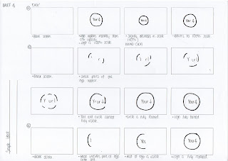
Ideas for Ident
The ident has to be simple, my target audience don't care what the ident looks like, as quoted by one of my respondents 'The Channel 4 ident is fantastic, but it doesn't make me watch it.'
So no explosions or fireworks! Damn.



So no explosions or fireworks! Damn.


Tuesday, 29 November 2011
Testing the Menu
Using a picture of a programme that might feature on my channel, Grand Designs:


This is beginning to look more authentic, however, I need to change the black type.

 This is with the opacity adjusted, this looks much more refined. I need to change the logo to the right hand side as specified in the branding guidelines.

I just tried to reverse the colours, however, this does not work anywhere near as well.

This is with 80% opacity, it looks much better as the blue isn't too harsh, and it doesn't distract from the programme too much.


This is beginning to look more authentic, however, I need to change the black type.

This version is much better, the colours work well here.


I just tried to reverse the colours, however, this does not work anywhere near as well.

This is with 80% opacity, it looks much better as the blue isn't too harsh, and it doesn't distract from the programme too much.

This is with the same opacity but a different alignment. This will be my final menu.
Menu
The menu has been quite easy to design, the colours are fixed, blue and white/black, and the font choices are fixed. It is just a case of applying the branding, to some kind of rectangular shape across the bottom of the TV screen.


Pre-Launch Screen
Ideas for my static pre-launch screen:
These are my first ideas and my least favourite, as my design develops I like it more. The last two examples would be good to be shown on screen a month before the launch, without the repetition of the word nature!
These ideas are much more suitable and in keeping with the branding. Reviewing these ones, for the screen which will display the channel numbers, Cooper Black in the Your 4 blue will be most suitable.
Black looks too harsh and distracting from the logo.
Final Two:
The first one will be displayed on the channel's frequency a month before the launch, the second with the channel's numbers on (for reassurance) will be displayed a fortnight before the launch.


These are my first ideas and my least favourite, as my design develops I like it more. The last two examples would be good to be shown on screen a month before the launch, without the repetition of the word nature!
Black looks too harsh and distracting from the logo.


Assett: Remote Control
Photoshopping an existing remote.

Then it didn't look good at all.

These two don't even look like remotes.

Logo is out of place, but slowly getting there.
 A little more of an improvement.


Then it didn't look good at all.

These two don't even look like remotes.

Logo is out of place, but slowly getting there.


Looking better.


Further Logo Ideas
Open publication - Free publishing - More design
Page 1 + 2:
Using the Channel 4 Pantone Pallete, experimenting with different strokes and fill.
Page 3:
An accident that seemed quite interesting - although not suitable for this brief.
Page 4: Eliminating the colours already associated with other channels.
Page 1 + 2:
Using the Channel 4 Pantone Pallete, experimenting with different strokes and fill.
Page 3:
An accident that seemed quite interesting - although not suitable for this brief.
Page 4: Eliminating the colours already associated with other channels.
Digital Onscreen Graphic


As my logo is going to be colourful I don't think there will be any need to have a DOG, as it just looks like an annoying price tag. The research too shows its annoying, and can be distracting.
More Logo Ideas
Taking into account the PDF I found and my logo research about targeting older people:
(http://g-byrne0912-dc.blogspot.com/2011/11/colours-for-my-target-audience.html)
- Avoid seriffed fonts
- Do not use condensed fonts.
- Light colours e.g. white on a darker background can be easier for a partially sighted/older person to read.
- Use high colour brightness
- Simplicity is key, no fancy shapes, fonts, colour combinations.
My logo needs to be clear and not easy to confuse with other channels, or have any associations. For example, my orange and white logo can be completely written off now, as when I trialled it on a square I thought Easyjet. The other channels belonging to 4 use red (Film Four), purple (e4), green, (more 4) and
(http://g-byrne0912-dc.blogspot.com/2011/11/colours-for-my-target-audience.html)
- Avoid seriffed fonts
- Do not use condensed fonts.
- Light colours e.g. white on a darker background can be easier for a partially sighted/older person to read.
- Use high colour brightness
- Simplicity is key, no fancy shapes, fonts, colour combinations.
Open publication - Free publishing - More design
Page 1: More colour trials for my logo - I love the deep purples but they are too similar to the e4 colour. I think the deep pink works too but that might be too feminine.
Page 2 + 3: Trialling different shapes, I chose the circle as its simple and quite friendly, with no sharp corners.
Page 1: More colour trials for my logo - I love the deep purples but they are too similar to the e4 colour. I think the deep pink works too but that might be too feminine.
Page 2 + 3: Trialling different shapes, I chose the circle as its simple and quite friendly, with no sharp corners.
My logo needs to be clear and not easy to confuse with other channels, or have any associations. For example, my orange and white logo can be completely written off now, as when I trialled it on a square I thought Easyjet. The other channels belonging to 4 use red (Film Four), purple (e4), green, (more 4) and
Monday, 28 November 2011
Logo Ideas

Looking at some of these ideas I have clearly not thought about my target audience. The type must be clear, and sans serif.

These ideas are much clearer, and I think having the name inside a plain shape will increase the audience's ability to recognise it, especially on screen when the logo may be placed over the top of a programme or image, it has to be distinguishable.
Potential Names Updated
New additions after crit feedback:
4Choice
Select4
Screen4 - maybe too cinematic!
4Vision - too similar to BT Vision, or an opticians!
Your4 - final choice.
Your4 seems like a suitable name, it fits in with the Channel 4 portfolio, E4, More4, Film4, and it suggests this channel is just for over 60s making it seem more exclusive, as I have found in my research there aren't any channels that target this one audience which means channel flicking, this one channel will contain all the programmes my audience needs.
Subscribe to:
Posts (Atom)