At the start of the module I was extremely nervous about this brief; I think the word ‘competition’ unsettled me. The fact that this was a collaboration made the brief seem less daunting as I do like working in a partnership from time to time as it normally forces you to work outside the comfort zone.
My collaborative partners were Naomi and Ellie, I had not seen a lot of Ellie’s work beforehand so I had no idea how she worked. Naomi on the other hand, is interested in type and layout and always gets good grades. Her typographic interests are the opposite of my image making background, but this could complement very well. Ellie too is interested in image making.
Picking the brief was incredibly straight forward, it was a brief we all had in common, and were quite excited about, I knew we would work well from this initial chat. Delegating jobs again was quite simple, I like doing primary research and Ellie and Naomi prefer secondary research.
It took a while for our visuals to match each other, as at first Ellie’s was completely different, and after it became clear from the crit the ideas were not working as a range, the designs were changed. Another crit saw Naomi’s having something different to Ellie’s and my designs. In the end our visuals were consistent across our ideas.
I really enjoyed working with Naomi and Ellie, they were easy to voice opinions to, we weren’t afraid to say something wasn’t working, but were always there to award praise for good ideas. Our different interests and complementary skillsets made our team the perfect collaboration. We produced work that we were proud to show off and happily sent it to YCN.
In terms of practical skills, I didn’t learn anything new, but I didn’t feel it was the time to learn new tricks in software. However, I did do vector illustrations, something I always promise myself I will practice but never do due to lack of confidence, but working in a team I didn’t want to let them down so I tried, and succeeded, even though the ideas weren’t used.
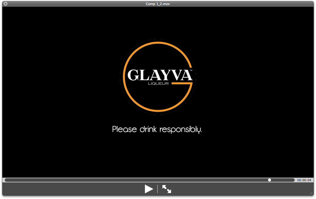
I am really pleased with the final motion graphic I produced, it had a great flow to it which is the kind of feel I wanted. However, I do wish I had included music, I think it would have really refined it, but it was taking far too long to select music so this can be added after. It does show how it would work on the LCD London Underground digital panels.
Through our strong work, I feel we successfully answered the brief, the design was contemporary, which is more likely to attract the younger, more affluent audience Glayva are striving to attract.
Friday, 25 March 2011
YCN... Final Advert
This is much more refined, the end shot stays on for the audience to see, which is what finishes it off. Now to check with the group...
Hooray! They liked it. Great, that's my part done, now to see if the others need assistance before deadline.
Thursday, 24 March 2011
Tuesday, 22 March 2011
YCN... Advert 3
Here, the text has been held on for a second longer to enable the audience to read the flavours unlike the other ideas which just flashed up and quickly disappeared. This is beginning to look more how I see the final to look.
YCN... Question and Answer Crit
We found this crit really useful, it helped to clarify those areas that were not as strong as our stronger areas.


Monday, 21 March 2011
YCN... Advert 1 Revised Part 3
This has more of a flow to it, with the lines moving across, instead of how they were before.


YCN... Advert Stills 1 Revised Part 3
Another suggestion was to keep the lines moving, at a higher transparency so it is only featured there subtly throughout the advert.


YCN... Advert Stills 1 Revised Part 2
With the suggestion of changing the lines to white. Although it looks effective against the black, in my opinion, it is maybe inappropriate as it doesn't match Ellie's posters which have the original orange lines on, one of the main criticisms of our work during last weeks crit was the posters not fitting in with the rest of the work. But it still looks cool, group feedback will decide whether we go with the 'Glayva' orange or white.


Subscribe to:
Posts (Atom)