Due to not having access to all of the high resolution files, only two of the posters were submitted. I am pleased with how they turned out, I understand the client was very happy with them, even if it isn't my usual style or type of work. It was great to work on a live project, and it was all produced in Quark which I had never used before and was introduced to a few hours before I had to have these posters ready. I couldn't even work out how to place an image. A huge challenge, but I managed with some trial and error.
Showing posts with label Finals. Show all posts
Showing posts with label Finals. Show all posts
Tuesday, 13 December 2011
Brief 4 Boards + Evaluation
I was incredibly excited about this brief at the start, it was by 4Creative (who I would love to work for), working on branding (in my rationale) for a new television channel (an interest of mine) - it couldn't be more perfect. However, the target audience was over 60's, an audience I know very little about, time was ticking and I didn't have much time to do in depth research into them, however I gathered primary and secondary research that I felt was reliable enough to draw some assumptions and base my concepts around this.
The idea of branding was very appealing, but to a new television channel, it is my dream brief. I thoroughly enjoyed working on this, however I feel a major weakness is using stock film footage - due to my lack of equipment and knowledge of film, but they supported my ideas wonderfully. IT really finishes off what I have working alongside, as an animated logo on its own didn't seem as entertaining as a dog in what seems to be a pair of older person's glasses looking at my animated logo and then looking directly down the camera at the viewer.
I enjoyed creating the guidelines for the branding too. It seemed to make my idea more credible and more genuine, and the research behind all this was very interesting too, I learnt a lot about branding and design for television.
Brief 3 Boards + Evaluation
Open publication - Free publishing
Brief 2 Boards + Evaluation
Open publication - Free publishing
This is the brief that caused me the most difficulty, to begin with I was excited and came up with a logo I was pleased with, and I think at this point, I spent too much time creating stuff, instead of actual work that was for a purpose. At this point I wish I had moved on to another brief, but I was that worried about time, I carried on creating unsatisfactory work. Having a break from the brief allowed me to look at what I had done with fresh eyes, and totally turn my ideas around. I spent at least a week producing work that has been completely scrapped, when this week could have been used developing other briefs. This is something to learn for the future. This brief allowed me to explore branding and promotion, which is what I want to carry on doing, and it is in my rationale. I struggled with creating a brand/idea/concept for a target audience that was as vast as what I had to work with, the different demographic of people in a hospital is very vast, and this brief was about appealing to as many people as possible. I feel I should have taken forward my ideas to my presentation boards, instead of not developing them further. I had already been told to push my deliverables, which should have been my wake up call.
Brief 1 Boards + Evaluation
Open publication - Free publishing
Sunday, 11 December 2011
New Poster Final


I have used two bright greens from the logo colours, the reason being as mentioned in the post about the other poster. This will really stand out from the hospital signage - these posters are designed to be put up once the gallery has opened to fill in some missing gaps from the first one! Bringing art into hospitals is pretty straight forward, the poster does what it says, but for those who aren't necessarily interested in the art as such, it will be an ideal place to reflect and relax, a brighter more enjoyable place than the hospital wards.
These will be printed on the same stock as the previous ideas, a matte card, the dimensions for these are 420mm by 200mm.
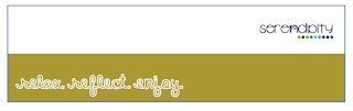
New Gallery Poster Final

This is the final choice for the poster that will be posted around the hospital while the Gallery is being installed. The bold green is enough to stand out from the usual blue seen around hospitals. The type written in white also stands out, in a friendly informal font, again different from the usual typefaces from hospital signage, it also reinforces the idea of the white space - the gallery will transform the empty dull space.
This is a good way of exposing the brand and to create curiosity, until a week later when the gallery will open, and the next set of posters with the location on it.
Exhibition Poster Final
This will be in A4 format displayed in the gallery and on the door to the gallery: it will not be displayed around the hospital to avoid confusion with the Serendipity advertising. There was going to be a postcard sized version, for distribution around the hospital, but again to avoid any confusion, the signage for Cynosure is for in the gallery only.


Friday, 9 December 2011
New Letterhead Final

New Business Card Final

Final Bookmarks
I originally was going to produce one, which I have but 9 colour variations, of the different colours from the logo. There won't be a blue outline, this is purely to illustrate the boundaries, the size of this is 14cm x 4cm:


Monday, 5 December 2011
Final Motion Graphics
The following two will be my final trailers (16 seconds long), both with different beginnings, but still communicating the idea of the mystery of CCTV. The question 'Who is watching you?' is to leave the viewer wondering and curious about who might be watching them, as many people are unaware of when they are in fact on CCTV. This curiosity is designed to lead them to watch the programme.
To me these two communicate the best what the programme is about without saying this is a documentary on CCTV. I wanted to leave a sense of mystery. The abrupt ending is on purpose, almost like the tape has been cut off.
Final 1 for TV:
Final 2 for TV:
This will be my final sting, it only just fits into the guidelines set for the duration of the sting - under 7 seconds. It is short enough to get the title, day and time across, and for those who have seen the trailer will be aware of the programme topic, those who haven't may be curious (or confused). The impact noise should attract the attention of whoever isn't looking at the TV screen.
Sting (with sound) for TV:
Sting (no sound - for Digital Escalator Panel boards)
Tuesday, 29 November 2011

Thursday, 10 November 2011

Monday, 26 September 2011


Subscribe to:
Posts (Atom)