Monday 31 October 2011

Insert My Less Paranoid Message Here


My 'remix' of the counter-terrorism poster, see Design Context.

Tuesday 25 October 2011

Thursday 20 October 2011

Friday 14 October 2011

Thursday 13 October 2011

Another Idea in the Equation...


Another idea to think about... Now I really am stuck. I do really like this idea, it has the balance of one of the first idea on the previous blog post, and the clearness and clarity of the second one.

I have less than 24 hours to pick one.

Print slot: 2pm.

Mini Informal Crit

As I am coming up to both my Brief 1 and Manchester Book Fair deadline, I need to select my final pieces. I am not comfortable with the quality or content for my book for Manchester, so I will be submitting one of my Mexico prints.

Jonathan Finch and Steph Bourne both preferred:


Although Steph felt, the opacity should be adjusted so it is more opaque.

Naomi Farrar and Rob Green both preferred this one:


I am torn between the two, after a chat with Rosalind I became even more torn, with the first one, the type is even and so in terms of the image it works well, but with the second one I quite like how the word Smile stands out but in terms of hierarchy I see Smile then the rest of the text which isn't what is intended. Kim Sandford and Hazel Gage also liked the top idea better, I have decided to pick the first one.

After looking through the earlier designs for the skulls Rob commented that I shouldn't let the skulls go to waste, maybe I could use one as a tag to go with the poster?


Hotdog Fold

For the Manchester book fair brief I am undecided whether to sell a print or create some books, originally the books would contain all the skulls I designed. But as I look at them, they annoy me now, and I don't feel as happy with them.
What I did really like was the flower pattern I created for the Mexico brief so I thought about developing some more based on the existing flowers and colours in it, to keep it uniform.


I then created a test hotdog fold book so I could see if it was going to work:


They look great together... however I am not sure this will work. I feel more confident creating a print which requires no hand crafting - although I would love to create a set of books.

Unless... I created a set of notebooks, using this cover.

Wednesday 12 October 2011

Typographic Eyes

Just an idea I started drawing:


Computer version:

Using the words To Death With A to form an eye using the warp tool on illustrator.

The A looks quite odd here, it may look better on the same line as with, to give it a more rounded smoother edge.

This actually looks really weird, and slightly, I know simple designs can work well, but this is too plain.
This looks much better, and works better as a shape for an eye-socket.


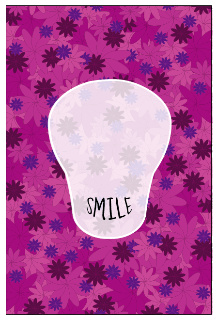
I have used the repetition of 'Smile' to represent teeth. I think it looks quite effective along with the eyes, as both have two lines of text.


I am not sure if the 'Smile' works better in this one. It is easier to read, and gets the point across.


Just another idea - I will definitely be sticking with the full line of text 'To death...'. Here I have adjusted the opacity, I have put it up to 90% as a peer suggested it may look better.

Adding type

Adding text:


Ideas

I quite like the idea of the skull being semi transparent - just need to see if it will work with type.

I am not sure if the fully opaque skull is a bit too bright - maybe another colour would work better?
Colour Experiments:
Looking at these, I think the application of colour takes away the fact it's a skull - in my opinion anyway. To me the shape just appears to be a coloured blob, but in white it is more clear that the shape is in fact a skull. If I place the final text on it may become visually more effective.
I do like the idea of just the white stroke, however to apply a text layer on top of this would make it difficult to see.
By applying a semi transparent layer with the stroke, this still looks effective, and I would be able to apply text without worrying about legibility. This is the same as the previous idea but this time I have added the stroke.

Re-reading the brief

Its coming up to my last few days before I send my work off to Mexico! Very exciting. Just need to re-read the 8 or so page brief and double check a few things.
In the envelope:
- DVD/ CD containing the JPEGs of my final poster.
(Poster must be RGB, a minimum of 200 dpi and less than 25mb and named byrne_gemma.jpg)
- Registry sheet - filled in and signed
- Brief copy - with every page signed
- Photocopy of my identification
- Both authorisation forms filled in.

Wow.

Note to self: Information from John!
Airmail 3-7 working days £4.25 up to 2 kilos
AirSure 2-6 working days from £5.98
International signed for 3-7 working days £4.95 plus post weight


60cm x 90 cm

Rather a strange set of dimensions, 60cm x 90cm. This means a bit of altering for my pattern.
With the above pattern there is some strange 'bald' patch on the left above the middle...
Before clipping mask.


Final pattern.

Type

I really want to include the title 'To death with a smile' to my work, it is appropriate to show what this is about - a positive representation of death, more of a celebration of life. I like the idea of warping the type into a smile - which will go in place of the skulls mouth.
The two lines of text don't seem to work best for the mouth shape... Do I write 'To death with a...' or 'To death with a smile' - is this too obvious?