Tuesday 15 December 2009

Collection 100... Research Proposal

The subject matter of this new brief is...

Christmas.

Possible categories and interrelationships I can look at will be...
Food, Drink, Media, Events, Graphics, Illustration, Colour, Logos, Symbols, Fashion, Social Life, Religion, Traditions, Weather, Travel, Retail

Research Processes will include...

Primary methods: Field Research (Observations- Participant and/or Direct), Surveys (Telephone/Internet), Photography

Secondary methods: Books

Who and Where will I research?

Primary Sources: Leeds, Scunthorpe, Family, Friends, General public

Secondary Sources: Television, Books, Video clips, Existing images

Research processes will include...

Photography of towns/cities at Christmas, family celebrations, shops etc. as primary, also, interviews with family members and friends.

Watching the news showing other towns celebrating, for example GMTV, existing images from past celebrations, collection of objects.

Monday 14 December 2009

What If...

This brief is a continuation of Collection 100 which instructed us to identify a problem in Leeds that affects some part of the general public. The resolution needed to be presented in the public domain and recorded in a suitable format. Fact based evidence also needed to be included to prove this problem is actually genuine.


As this is group work, responsibilities and tasks needed to be shared out equally and appropriately, and discussions and agreements needed to be reached by all members. From mine and Hazel’s past group work experience of How To... we understood how essential this is to the development of the group.


In our first discussion we tried to find a problem that may link our already existing themes. Safety was discussed especially with changing seasons, as it is now turning to winter and the nights are drawing in, and so more safety precautions are needed. From this we decided to generalise into crime in general, graffiti was a suggested topic, which would visually be a great topic to explore. However, decisions could not be reached, so everyone went home to research newspapers and the internet for some existing problems in Leeds, possibly related to crime or some sort of taboo.


I looked on the Yorkshire Post website for any news material on graffiti and did not find anything, I generalised my search to other websites, and from the lack of current stories I realised this is not a major issue, and to explore other areas. I decided to narrow down my collection of stories, including the postal and bin strikes, to two, so that when it came to regrouping, we didn’t spend all the time trawling through lots of research.


One story that caught my attention was about a gang operating in the city centre who snatch purses in supermarkets, relating back to the brief this would be an appropriate topic, it is a problem that will affect the public, the fact that the story is in the paper shows it is a genuine problem.


Another story that caught my attention was a drugs raid on a night club in the city centre, this would not affect as many people as the previous issue would, but it would still affect some sector of the general public.


Sai and Will did manage to find some stories on graffiti, but they weren’t particularly major stories, and there were probably more pressing issues in Leeds. However, one story was quite interesting about someone named Moose, who did a reverse style of graffiti, instead of adding to the walls, he took away the grime and dirt off them, here is an example:


Another idea that was brought up by Nick was the bus strike in the festive period, which could provide us a job to inform of other ways of travelling around the city. I mentioned something I had read about certain areas of Leeds being no-go areas for people under the influence of alcohol to try and control the behaviour over the build up to and after Christmas.


After we shared all our research the subject homelessness was brought up, it wasn’t an idea that fell into place straight away as I think we as a group had our hearts set on the graffiti idea, however, a few more ideas were put forward on the subject of homelessness and as we as a group lacked knowledge on homelessness in Leeds, maybe the public lacked knowledge.


Meryem joined our group today as she had been away, so I gave her a brief overview of what the group had come up with, so she was as up to date as we were, instead of catching up and missing out on voicing her opinion.


We stuck with this idea, and decided to go away and research various areas of homelessness, Will and Hazel live with someone who volunteered at a homeless shelter, so they would interview him about the shelter, what it does, and homelessness in general, Will came up with the idea of collecting personal opinions of this subject matter, so Hazel said she would create an online survey to post to people to complete. Nick’s Mum had contact with a homeless shelter, so he would question her about that, I was going to look into the causes of homelessness, and also ask my Mum about the subject, as she works for Addaction that deals with drug and alcohol misuse, and often as a result of this lifestyle choice, the ‘clients’ are homeless, or of ‘no fixed address’. Sai too was also researching this.


Before I started investigating, I visited the Shelter website, this is a well-known charity for homelessness, the purpose of this was for self-education as I lacked knowledge on what classes an individual as homeless, what causes this and what charities like this and the government do to try and combat this.


When speaking to my Mum, she said some of the ‘clients’ are homeless because they are funding for their habit, so cannot afford rent etc. and some are homeless for whatever reason and end up on drugs. She also said that some are not technically classed as homeless as they ‘sofa-surf’ on friend’s sofas, so while they have no fixed address, they aren’t sleeping rough. This touched upon an issue we already faced, what exactly is homelessness, as there are different types, and the definition varies form country to country. For example the types of homelessness we have here are:
(taken from the Crisis website)
- Legally homeless: A household is legally homeless if either there is no accommodation that they are entitled to occupy or they have accommodation but it is not reasonable for them to continue to occupy this accommodation.
- Officially recognised as homeless: Those who are both legally homeless and have successfully applied to their local authority to be classified as such in the current year. A household can be legally homeless but not recognised by the state as being homeless because they have not applied to be classified as such.
- Statutory homeless: Households that have been found to be eligible for assistance, unintentionally homeless and falling within a priority need group and thus owed a main homelessness duty by a local housing authority.. In 2006-07, 73,360 households were accepted as statutory homeless in England. Local Authorities made 159,330 decisions on homelessness applications.
- Hidden homeless: This refers to homeless households, which may or may not have applied to local authorities for homeless status, but are not entitled to any accommodation. Crisis estimates that there are around 400,000 such 'hidden homeless' adults at any point in time.


We regrouped the following day to see what each other had found out, what was particularly interesting was the responses to the survey that was submitted on http://www.surveymonkey.com/, some of the questions were not worded correctly which lead to confusion, which meant the validity of the answers were not acceptable, and therefore I chose to ignore those answers. Sai and Nick analysed the answers in an attempt to formulate some statistics as part as our evidence.

71.4% of the respondents were 16-25, however some were in the 26-35, 36-45 and 56-65 category. The quantitative answers were much easier to analyse, and from this, the statistics could be generated, however, the qualitative answers were much more complex. A total of 28 participated, the majority being from Leeds, however there were responses from Scunthorpe, Nottingham, Birmingham, Manchester, Lincoln and Wisconsin, USA.

60.7% of the respondents felt that homelessness is an issue in their city of residence. Another question that was asked is, ‘How do you feel when you see a homeless person?’ I personally did not expect the answers that were given, the majority of people, did seem to have a lot of sympathy towards homeless people. 80.8% said that when they saw a homeless person they just walked on past them, and 11.5% said they would give them money. There was an opportunity on this question to give a qualitative answer, where someone even commented that they had housed a homeless person before.

Another interesting question was ‘Why do you think people are homeless?’ the vast majority assumed that the main cause was substance misuse and family/relationship breakdowns. Other answers included financial difficulties, a fairly obvious cause, mental health issues, disability, and job loss. After research on the Leeds City Council website, one of the most common causes of homelessness is parental eviction and domestic violence.

When asked, ‘Do you think there is enough help for the homeless in your city of residence?’, 69.6% thought no, there was not enough help. Again, there was an opportunity to make a comment on this, 10 people made a comment, around half of which were unsure of what help is actually available, one comment made was ‘…there needs to be initiatives to stop people becoming homeless, rather than to help them when they are.’ I think this comment is correct, but there still needs to be a lot of help for those who are homeless, as it is not something that can be easily prevented sometimes.

Nick had taken out a book from the library about the St. George’s Crypt, which is a charity that cares for homeless people in Leeds, and has done so for around 80 years. I went on to the website to find out more information and read an interview with a homeless man called Dougie, who has now passed away, he went to university and after finishing travelled the world, got married and had children, but sadly his wife was diagnosed with breast cancer, and that is where Dougie’s downward spiral started, as when his wife died he began drinking more and more, which resulted in losing his house, children and job. It wasn’t until he ended up in hospital in a coma that he realised he needed to stop drinking.

As a further point of research, I then decided it may be appropriate to contact St. George’s Crypt to ask a few questions as this may help us to identify a more specific issue. I rang the crypt up and spoke to a gentleman named Martin, (who I believe is in charge of fund raising) after introducing myself and explaining a little about the brief, I asked ‘How many people of no fixed residence use the facilities?’ To this Martin replied, that on average about 60 a day come along to the crypt, and roughly 15 turn up at night. This made me wonder where the rest of them stayed for the night. Another question I asked was, ‘Without the public donating money or volunteering, in what ways could they help out’, the reason behind this question was, not everyone has the time or money to help, so it might be good to raise public awareness of how they can help out. The reply to this was that people could donate old clothes and blankets etc. which is partially the response I expected; however I was not expecting the next part of the answer, in which Martin said, that they would welcome people with skills such as teachers who could help out.

Due to the first part of the brief being about photography, we felt that photography may be an interesting point to research, 2 of my Black and White film photographs were of a gutter with rubbish and leaves which was quite an interesting image, and we felt that this may be a suitable type of image to use. I thought that may be some photographers that have taken photos of homeless people; I found one book in the library but this was from less economically developed countries, so it wouldn’t have been appropriate. I think there was an absence of photos as some sites claimed that photographing homeless people was actually illegal, however some claimed it wasn’t. It was then that Hazel came up with an idea that maybe photographing someone acting as a homeless person may be unnecessary, and I guess it is also a little inappropriate, but then she suggested that we could use an image of where a homeless person may have sat. Looking back now I realise, this was a waste of time making these decisions as we had not yet identified a problem.

For the presentation on Friday, we had 3 A3 boards to create, Will and Meryem were in charge of our first board; the problem. Nick and Sai were focussing on condensing the group’s research to ensure only relevant research was featured on the board. Hazel and I worked on the intentions board. The boards needed to be created, and from mine and Hazel’s past experience of working in a group we decided that to create the boards, one person should sit at the computer, Hazel, and the others would sit around and we would all have an equal say. This is better than the entire group going away and all creating something completely different which would then need to be negotiated. Everyone had a say on all the boards, but there were 2 main people assigned to each board, who would talk about that particular board in the presentation.

Our intentions were to have the general public as the target audience, particularly older people who may have more time, and our objective was to inform and educate them as to how they can effectively help the homeless without donating, this would be done in the form of a campaign. The boards were finished in good time, which gave us time to have two rehearsals in the tutorial room and have some lunch. We were very confident and felt positive about our presentation, this was reflected in the feedback we got from our tutor, Amber and a few peers who thought we had presented a strong presentation and had carried out lots of research. Our tutor gave us a lot of positive feedback and this boosted the positive vibe of the group even more.

Before we had chance to start the presentation one of the tutors, Fred had left the group. Because of this, we decided to get his feedback on our ideas, afterall, the more feedback we have the better. There were a few comments made from other peers about our ideas after the presentation commenting on the design of our boards, this is something we took quite seriously, and tried to aim for a professional look.


Fred had pointed out that the issue we were dealing with was too big for such a small time-scale brief, and basically told us to go away and find more problems that stem from homelessness. The group had a small chat before we went home for the weekend, and we all tried to look into issues within homelessness, that we could use as a problem. Amber was really pleased with the amount of research we had carried out, and thought the presentation was a positive reflection of the group's work.
I went home that weekend and brainstormed a few ideas based on ideas discussed previously:

- How do homeless people get into the city?


- Bus, train?


- Do they know where to go?


- Where is safe?


- How can they keep warm?


- What can they do to help themselves?


- Sell the big issue?


- Volunteer?


- Stay in a homeless shelter?


- Look into going back into education?


- How can they stay alive, especially in Winter?


- Find accommodation?


- Sheltered area on the streets?


- Visit Soup Kitchens?


- Beg?


- Charity shops?


- Harm minimisation?


I decided after the chat with my Mum I would research into if there is a drug problem among the rough sleepers in Leeds. I found an article on the Leeds Accommodation Forum website about the Leeds Rough Sleepers team, this revealed some shocking statistics including that 95% of the new clients they have had recently have drug related issues. Even more shockingly a spokesperson revealed that in the past 8 weeks, there have been 4 drug related deaths among rough sleepers. Drug related deaths seemed a little too vague, so I did a little more investigation and found out that a common occurrence is for the substance dependent rough sleepers to inject crack cocaine, which is quite deadly, and 2 years ago this activity was quite a rare thing to happen among this group of individuals.


When we regrouped after the weekend, Meryem had looked into women and children being homeless, this was quite an interesting problem that I had not even thought about, Nick had looked at education, as homeless people will not have the same access to education that we do. Will had looked further into shelters, and Sai had looked at healthcare, which linked up to a copy of the Big Issue that Nick had brought in, which said how 50% of the Big Issue vendors use accident and emergency as their primary source of care. Sadly, Hazel had not done any research which didn't look too great in front of Fred, but we had enough research to work with.


We built on the idea of encouraging older people who may free time to volunteer at homeless shelters, especially if they have skills for example, teaching, as in the phone call with the St. George's Crypt it seemed that there was a lack of volunteers with transferrable skills. Other ideas were being thought up such as getting the public to donate blankets, and clothes etc, but then again, most charities ask people to donate things, we need to do something which hasn't been done before, because if the other campaigns were that successful they would not be constantly appealing for help.


We tried to come up with ideas for Meryem's idea about homeless children who are not in education, but realised it was quite a difficult topic to research.


We then began looking at my research and I brought a question up, "Why has there been 4 drug related deaths in 8 weeks?" which brought up the question of "Why are these users not getting help?", "Are they aware they an get help?", "Do they know where they can get help?". Ideas began to flow of ways of directing homeless people to medical centres where they can get help, but the issue of how to target a campaign at homeless people cropped up again, previously this idea had been dismissed rather quickly. Soon enough the idea was sounding quite strong, as we came up with the idea of creating signs that would give a distance to the nearest medical centre that homeless people can access.


The visual would be the trickiest part, as it needed to be simple, to the point, and have some sort of urban/street feel. I felt posters were totally pointless, as posters tend to be aimed at consumers, and the target audience is homeless people, so they would probably not take notice of a poster, thinking it is an advert for something they cannot afford. We then decided we could tie in our original idea of graffiti in, it seemed like the perfect solution, we would create a stencil and spray it to places, however referring back to the brief, we could not do anything illegal, so we decided we could spray it on to college's graffiti wall and Photoshop it on to places, and create a sticker version to be placed in specific areas.
We found a place called the NFA Health Centre which is on 68 York Street, and using Google Maps we worked out that it was a 26 minute walk from there to the underpass near Woodhouse Multi-storey Car Park, which is often frequented by individual's of no fixed address, so this would be an appropriate place to display the material.

Ideas were flowing at this stage, and we decided a stencil idea could be very appropriate to the style we were trying to achieve. I came up with an idea of creating a sign that would look like a road sign with the white board and a black arrow on it, with the text. Sai created a few rough ideas, and from there the group decided this is the start of something great!

We decided that the next stage is to create a stencil to 'tag' on to college's wall, which we can then Photoshop on to places around Leeds, a printed sticker of this would also be created to test product placement. Will volunteered to photograph these various places, these are some of the images he took:


I worked on top of Sai's idea and came up with...


To be continued...


Sunday 6 December 2009

Collection 100... Photography

For this brief, the task was to take a minimum of 100 photos of objects, people, words, places and textures; the idea was that in taking the photos no prejudgements were to be made of the type of image that might be useful.

A list of photographers was provided to help with research such as; Martin Parr, John Rankin, David Bailey and more.

The mandatory requirements for this was to have 100 (7.5cmx6cm) hard copies of photos with no white borders, but all cut to size. Within the photographs needed to be evidence of experimentation with composition and the interpretation of the images.

As part of my photography project in my Foundation Diploma year, I took a series of photographs around Doncaster, I only went on to develop 2 of these images, so felt this may be a good time to dig out the negatives and get them all reprinted. These photos were in black and white and fitted 4 of the 5 categories.

I also used a few photos from my holiday in July 2009 to Tenerife, of the rocky landscape, one photograph features part of Mount Teide, a volcano. I chose to use these images as the colours are warm and which makes a contrast with the photos taken for the project.

These photos featured mainly objects, people and words, and were also mainly in colour, as these were in colour I have tried to make the photographs colourful to contrast with the schemes used in the other photographs, for example, a sunset, a purple scarf, a lava lamp etc.

Here are a selection of my photos:


Looking at the photographs I had to pick a theme that linked them altogether, this proved to be quite tricky as some of my images were a little random, I then decided that changing seasons may be an appropriate topic.

Once the photos were collated, the next part of the brief was given out, titled ‘What If’ and the class was divided into groups. In my group, there was Hazel, Will, Sai and Nick, and their themes were:

- Documenting changes – differences and similarities

- Contrasting colours

- Dark and light and things that shine in the night

- Night time close-ups.

With the themes the others had, I felt like my subject fitted in quite well, as with seasons changing there are contrasts in colours, differences and similarities across the seasons, the difference in dark and light is also affected by this.

Tuesday 1 December 2009

Visual Language... Photography

In this lesson, Simon Cherry and I were instructed to go around the college with a camera and photograph 50 light switches, which must follow a set of rules. Our main rule was to only photograph light switches with one switch on it, which must be pressed in at the bottom, with the top tilted out, and the final rule is that the image must be square on. As a result of these rules, and not having the ability to switch lights on and off around college, we did not find 50. The photos are not aesthetically pleasing, and in reality are quite boring, however I think if the rules we had picked were not as strict they could have been made more interesting.


Here is a sample of what we found:


Thursday 19 November 2009

No News Is Good News- Message and Interpretation

This part of the brief is entering visual design territory and leaving behind research, the deliverables are 3 posters in 2:1 format, which must be high impact, clear, memorable and challenging, but certainly not offensive. The first poster must be produced using text, and text only, the second must consist of just imagery with no text, and the third must be a combination of both.

At first I was going to use the exercise from before to help me with the posters, but decided if I was going to create a piece that is hard impact, I need to think of something that will have a major impact because not everyone would be affected by Stephen Gately's death, but everyone could be affected by an undiagnosed heart condition.

From here I set my own brief:

Brief- to produce 3 posters in different styles that communicate the importance of checking for undiagnosed conditions when illness runs in the family.

Target Audience- families with a history of illness.

Tone- concise, immediate impact, hard-hitting.

Format- portrait/landscape- I will investigate both.

I have included some of my development work as to how I arrived at my final outcomes.

For my text only, I didn't want a massive body of writing, just a few lines that are clear and concise, and engaging which would encourage the audience to visit a GP. My first set of ideas focussed on the idea of involving the word fact, in large letters, as people tend to pay attention to facts especially when it is a fact that may affect them. The wording first started out as, If your family has a history of illness, you should visit your GP however that did not sound as good as If there is a history of illness in your family, you should visit your GP.


This was my first idea I had, initially I was quite pleased with it, the choice of colours; red, black and white were colours that I like, and felt it would be an appropriate colour scheme as black is associated with death, a possible outcome of having a medical condition, the red is associated with blood and the heart, which sounds a little gory but it contrasted well with the black, and the white just brightened it up a bit more, and white is associated with clean and I personally associate it with doctors and the medical industry in general. To portray the idea of the information on the poster being a fact, I felt a stamp style font would be appropriate, to show that it is final and legitimate, which may make the information more trustworthy.

I then experimented with different layouts of the same concept;


This idea looks at using all of the text in the stamp style font, 4YeoStamp, I am not sure this communicated the right kind of message, however I was intrigued as to how the idea would look on a diagonal, as if it had been stamped, as stamps aren't always that precise.


I don't feel this works too well and seeked guidance from a peer and once the idea had been reviewed, it was decided that the stamp font was inappropriate as it portrays the idea of the army, rather than an important medical warning.
Just to be sure, I wanted to try the idea in reverse, so a black background, and white text;


In terms of colour and contrast I feel this works better, however, it has become clear that the stamp font appears quite complicated and makes the text appear less legible.

I wanted to try another idea, that would still use the stamp but be smaller and more subtle instead of being so 'in your face'.


This looks much tidier and clearer, but I still feel the design is lacking something, until I feel happier with my design I will continue to develop my ideas. This particular example loosely reminds me of a card from a board game, for example a "Community Chest" card from Monopoly, which is not ideal as I don't want my posters to be confused with anything else as the message I am attempting to communicate is very serious.
I have not decided on which way round my colours will be, as the white background brings across a clean, clinical feel and the black is much more sinister.


This is much clearer than the previous black background example, I feel I am getting closer to producing a final piece. I think the stamp font needs to be swapped for another bolder font, as this now appears to be unclear now it has been made smaller.

The word fact looks much better in the same font as the body of text, but bolder, however, I tried to change the font layout, and I do not like this at all, I will stick to the left alignment for the main text, and right alignment for the word fact.

I felt it was time for a review with my tutor, and after a chat, I came to realise that the word 'fact' seemed unnecessary, and it didn't really serve that much of a purpose. The text itself seems quite self explanatory and is based on common sense, although it did seem a good idea to use this word at the time.

I feel quite strongly about this piece, and think it could be a potential final resolution to my text only poster. It is clear concise, and I think the colours work well. The words kill and you are red to make them stand out from the rest, to make the audience read the full information so they are aware what might effect them.
I think if I tried this idea with a black background, that it could quite possibly be the final outcome.


I am really pleased with this outcome, I think the colours suit the message being portrayed, as the message is quite urgent and having the words 'kill' and 'you' in red against the black, makes it that little bit more sinister, and quite directive to the audience, as if the poster is speaking to them personally. The text is clear, and the order in which it is read is appropriate, as the audience will view the red text first, and wonder what the poster is about, and what could harm them, therefore making the reader continue to read.

Friday 30 October 2009

No News Is Good News

For this brief I had to select an interesting headline form Saturday 17th October and produce a body of research based on it. To begin with I looked at several headlines, one titled 'PRAMBO', which was about a pram rolling off a train platform and being pushed along the track by a train, the baby escaped alive, with a cut on his head, the second one was about Stephen Gately's death, and the third was 'Pythons 40yrs on' which was about the 40th anniversary of Monty Python.

I chose the headline 'Nothing will ever be the same without our dearest friend Stephen...rest in peace, brother', from The Sun, mainly because of the amount of media coverage the story has had, and some of the mystery surrounding it, which may come across as morbid, but at the time of print, the public were unaware what had killed Gately.

There were a number of ideas within this concept that would be research points:
- The tattoos (that Boyzone have got as a memorial to Stephen).
- Stephen’s husband – Andrew Cowles.
- The remaining band members.
- Funeral.
- The statement read out by Ronan Keating.
- Family and other mourners.
- Stephen’s life.
- The actual cause of death.
- The night of the death.
- Fans’ tributes.

Three ideas that I will take forward and investigate are:
- The remaining band members, especially Ronan Keating’s speech at Palma Airport.
- The funeral, the service in Majorca at a chapel, and a memorial service in London.
- The death and the events leading up to it- what really happened?

To do this the only research methods to get this key information is from the newspapers and internet sites, I did this with an open mind so I wouldn't believe the first story I read. I collected research from a number of sources, The Guardian, The Independent, The Daily Telegraph and The Daily Mail, I simply selected these because they are known for there straight to the point, no nonsense views, unlike The Sun, my original choice of paper, which does and is known for embellishing. I also took information from Wikipedia on the view of Gately's death, again with an even more open mind, as Wikipedia is editable by the public and may hold biased views.

I highlighted key points throughout the documents, and from here I narrowed down the key points even more and put them on to a mind map so cross examination could be done, as some papers shared similar views, while others contrasted completely.

Ready for the next session, we had to note down a statement of fact and a statement of opinion from the research, backed up by supporting evidence;
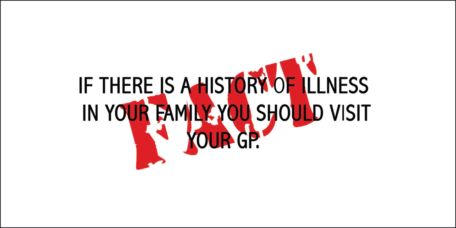
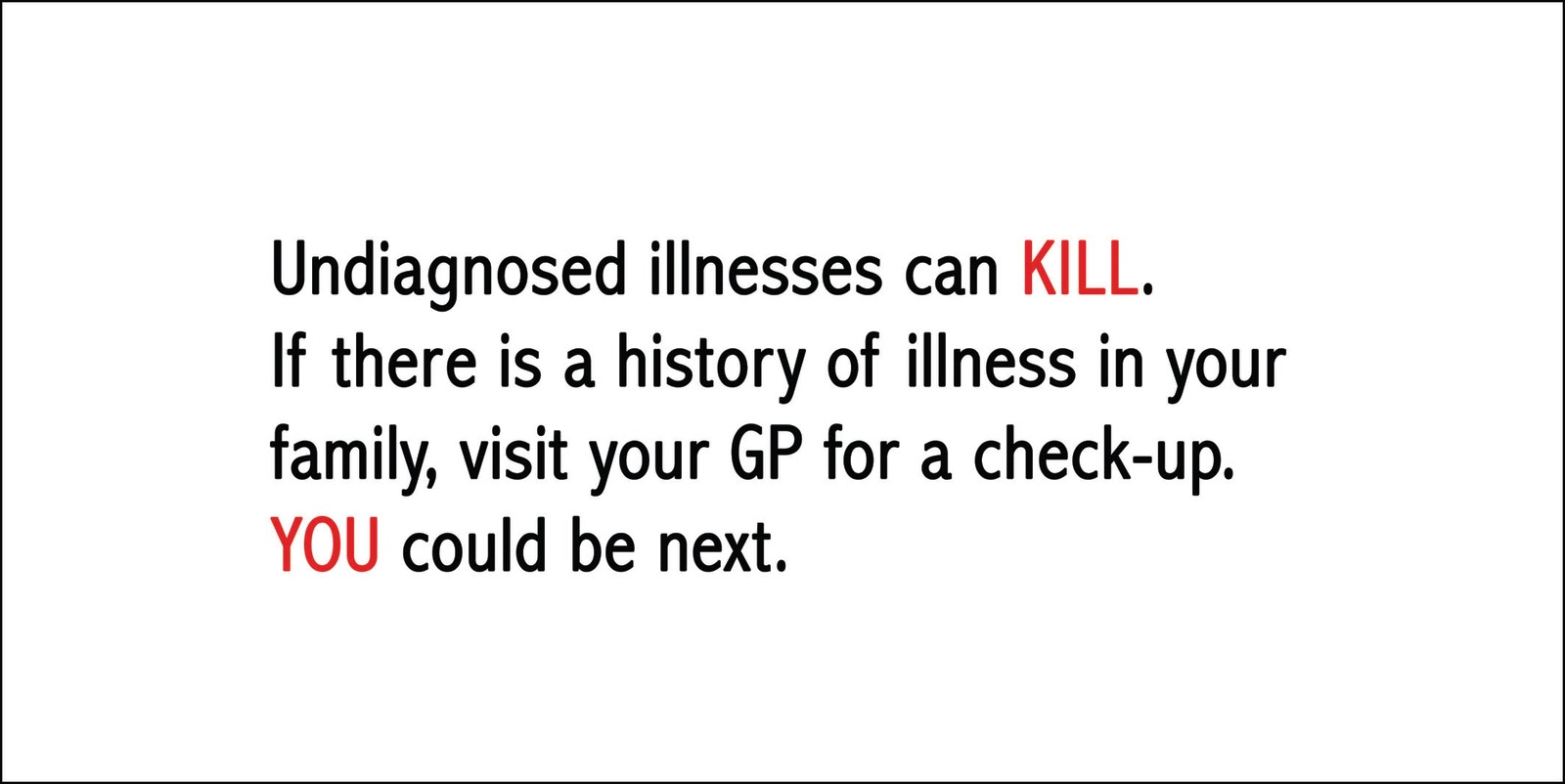
STATEMENT OF FACT:
Stephen Gately died from a genetic, undiagnosed disease known as pulmonary oedema.

EVIDENCE:
The post mortem results showed that the cause of death was natural (pulmonary oedema), which was paternally inherited.

STATEMENT OF OPINION:
'...our world changed forever when we lost our friend.'

EVIDENCE:
This is from a statement read out by Ronan Keating on behalf of the remaining members of Boyzone, read out atPalma Airport in Majorca.

We were then given the task of picking out 10 adjectives, 10 verbs, 10 objects (hand drawn) and 10 symbols (also hand drawn) which related to our research:

Adjectives: cold, numb, white, happy, sad, beautiful, bubbly, solemn, natural, brightest, heavy.
Verbs: speak, die, cry, carry, promise, pray, smoke, drink, made, change.
Objects (drawn): coffin, church, plane, flowers, star, gravestone, joint
Symbols (drawn): skull and cross bones, gay pride flag...

This exercise helped to kick start the visual thinking process ready to be given the next part of the brief...

Wednesday 28 October 2009

Alphabet Soup...Typeface

For this brief, the randomiser had picked me and fellow class mate Maya Srivastava to work together. The brief specified that a typeface must be created based upon an already existing one, which would include the alphabet (A-Z) and the glyphs ., ?, @, £, :, !, and it must relate to the personality or character of my work partner. As a starting point, we were issued with questionnaires so we could find out more about each other.

This is what I found out:
SIBLINGS: Younger brother.
BIRTHDAY: July 23rd (Cancer/Leo)
EARLIEST MEMORY: On holiday in France running along, she fell over and cut her leg and went running back to show her Mum.
PERSON YOU ADMIRE: Her Mum- because she manages to do so much.
MOST TREASURED POSSESSION: Mac.
FILM: Anchorman, or comedies and chick flicks.
DESIRED SUPER POWER: Teleportation- to visit friends, family and dog in India and Dubai.
EXTINCT ANIMAL TO BRING BACK: Diplodocus.
MUSIC: Lots, not heavy.
HOBBIES: Golf (joint family activity) and Horse Riding.
FAVOURITE ANIMAL: Dog.
FAVOURITE SHOP: Forever 21.
ACTOR TO STAR IN FILM OF LIFE: Jessica Alba.
DINNER PARTY GUESTS: Russell Peters (comedian).
WHAT MAKES HER UNHAPPY: Bad weather, being cold, being away from family and friends.
FANCY DRESS: Cowgirl.
PHRASE: Go for it!
OTHER INFORMATION: Good cook, Quiet-ish, Half Indian/Half English, Lived in Middle East until last year.

From all this information, I created a mood board to give me a bit of a visual kick start as I was beginning to struggle on what to do. After much pondering I came up with four words to help me down the right path; fun, quiet, girlie, travel.


I thought of manipulating an existing font so that all the bowls were Apple logos, but then I realised it doesn't really say much about Maya. After experimentations with a range of fonts, that were mostly focussing on the word, girlie, I found a font called Afarat IBN Blady, which is an arabic style font. I thought this would be appropriate as using a font like this would be communicating Maya's background, as her home is in Dubai where they speak Arabic.

Maya's name in the font...


At a group crit, I listened to others ideas, and gave input and suggestions on people's work, when I presented my idea the group as a whole felt the letterforms as they are originally, are a bit harsh so I needed to soften them to make it more appropriate to Maya, also they commented on the fact that the letters were a solid black which made them quite bold, something else that wasn't quite apt. However, they did like how I had gone for something completely different, which was comforting as this was out of my comfort zone, and I didn't feel all that confident about my idea.

To manipulate the letterforms were tricky, and I felt like I had gone for something quite challenging so it was fun, but I didn't want to alter the letters too much and lose the whole Arabic feel, so I softened the edges around the letters and adjusted some of the heights. It was at this point that I was beginning to worry about putting logic to the font, as the letters varied in size, height and width so to try and adjust them to a standard height and width would be a) quite traumatising! and b) visually, it would not work. There were a few elements that were the same throughout however.


On the right is the original letter E, and on the left shows the manipulated version...


I chose to do a black outline of each letter so it would really emphasise the feminine shapes, i trialled outlines with other colours but the black appeared to work better. After three attempts at tracing the letters onto A1 I finally had a final piece, now I had to make the name badge. For this I just used Maya's first name, and the letters had no fill with a pink and blue stroke, the reason to pick these two as a colour choice are simply that these are Maya's favourite colours. It was quite tricky getting the letterforms to work altogether, because they work much better as individual letters rather than joined. I wanted to join each letter up so it still looked like Arabic script but the text wasn't very legible especially as the 'Y' is a strange letter anyway. In the end I did much prefer the badge, it was lighter and certainly brighter and I felt it communicated Maya (below).


To me, the first 'A' and the 'Y' vaguely represent a smiley face, the bowl of the 'A' could be an eye, and the descender of the'Y' could be a smile. This isn't that noticeable but is still representative of Maya.

When it came to presenting my work, I did struggle due to a persistent, annoying tickly cough which made it hard to talk, but I think people knew roughly what I was trying to get at. Other than that, I think I did okay.

Sunday 25 October 2009

Visual Language... Ident

In today’s lesson we were asked to construct a letter of our choice, out of boxes, but it had to work across different plains, like the Channel 4 ident, where are at first it appears that there are a series of shapes until one certain point when you can clearly see it is a 4. We would create a similar sort of thing, creating a view finder to be stuck at one end of the table where the letter can be viewed.
We chose the letter F as it is quite a simple letter with no diagonals or rounded sections, but we would add serifs on for added effect. Black card would be attached to the boxes, and the black card is what would make the shape of the letter. Where edges of the boxes met, some of the black card had to be cut in half, this is strange to describe in words, but makes sense once seen. We had a wide selection of boxes to work with from cigarette packets to cereal boxes.

The group worked well together, Ellis and Charlotte were at the view point instructing where to put the card, while Polly, Robyn and I were cutting up and placing the card on to the boxes.

These are a selection of photos taken by Ellis/Charlotte throughout:


We had to place the boxes across the table...

This is how the boxes looked through our viewfinder...


Then we could start placing parts of the black card on...


There were a few issues with balancing the top bar of the F...


The final F...


Wednesday 14 October 2009

Visual Language Exercise Continued

This week, we did a similar exercise to before, using the letter A’s but instead of individual squares representing a word, and they had to work as a sequence of 4.
Some of the words we were given were taken from the Alphabet Soup brief of when an alphabet had to be created to represent, duplicate, compress, dissect, hybrid and edit. We were then asked to create single squares to represent the word, which is what we did last week.

Duplicate: For the first square, there was one A, then the next square there were 2, for the third there was 4 and for the last square there was 8, so as a sequence I think they communicated the idea of duplication.


For the individual representation I combined all 4 squares into one, with an extra line at the bottom.


Compress: I found this quite tricky at first but decided to use2 lines of 4 bold A’s for the starting square, in the next square, the top line was still the same but the bottom line wasn’t bold, for the third one the bottom line of A’s were in a smaller font, and finally, the bottom line was smaller still. I think this showed the idea of the heavy, bold A’s compressing the other A’s so they progressively became smaller and smaller in size.


For the single square example I had 3 rows of 2 Bold A’s with some smaller Bold A’s underneath in 3 rows of 3 which slightly overlap to show the idea of compression and being squashed.


Dissect: This was another tricky one, as one of the rules set was that the letters could not be cut into, which would be ideal for this word. Instead, I cut out 4 rows of 4 A’s and stuck them down for the first square, for the next one, it was the same arrangement but the letters had been cut into individual columns. For the third example the 4x4 arrangement was the same but the letters have been cut even further into blocks of 2, and finally for the last square all of the A’s had been cut into individual letters.


In the single example I had two rows of 4 A’s that have been placed at a 45 degree to each other, to show how they have been cut up.


Hybrid:
In the next series, I added a new font in each square, so for the first one, there was only one font, in the second there were two, in the third there were three and in the last sample, 4. This was to show how a hybrid is made up of different things. The way in which the letters were arranged were the same on each but bundled together at different angles, to show how the different fonts are part of one unit.


For the singular version, I feel this was probably my weakest representation, as it was the same four fonts used in the series, with one letter from each stuck in a line, again to show that the letters are part of one unit.


Edit: Some people found this quite tricky, however I found it was quite straight forward, as to edit something generally is to change or amend. So I started off with a letter A in the bottom left corner and then in the second example, the A was smaller in size and had been rotated 90 degrees clockwise and placed in the bottom right hand corner, for the third square the A is bold and standing upright in the top right corner. In the final square, the A is in the top left corner and has been rotated 180 degrees and is smaller than the previous one.


In the last single example, I have used 4 A’s, the first one is stood upright, the second is smaller and has been rotated 90 degrees clockwise, the third letter had been rotated a further 90 degrees and is bigger in size. The final letter has been rotated another 90 degrees and smaller.


Again, I found the exercise quite interesting as it really gets you to 'think outside the box'. I did find it challenging but that made it all the more intriguing, and again, it is great to see how the same information is interpretted differently by other people.

Sunday 11 October 2009

Visual Language Exercise

In this lesson we were asked to cut out 10, 10cmx10cm squares of plain paper, and we were given a series of sheets with the letter A printed on in different styles and sizes. Amber, our tutor, gave us a word and in 5 minutes we had to use the letter A’s to represent the word.

Closed:
For this word, I cut out 4 strips of 3 A’s and formed a square in the centre of the page with the strips overlapping; this is to give the feeling of something being closed in.


Difference: In this example, I decided the most obvious way to represent this was to have 2 A’s that were different in size, e.g. large and small and different in style, e.g. script and sans serif.


Link: To create the idea of links, I decided to overlap the A’s to show how they cross over to form individual links.


Loop: Here, I created a loop out of the A’s, with a slight overlap at the loop to show it did cross over.


Space: My representation for space, is very obvious, a small A in the corner of the page.


Horizontal: This is probably the most obvious out of the series, it was simply four A’s laid horizontally across the page.


Above: This was quite simply a small A at the bottom middle of the page, with four bolder A’s directly above it, the reason for the difference in size was to show the A at the bottom was a long way below the A.


Form: For this one I decided to do the shape of an A, which I felt would be the most appropriate, although I was unsure if I was communicating the right idea.


Positive: I first thought of a graph and positive correlation, totally forgetting of the symbol for positive, a plus sign, which is what I ended up doing for this one.


Finish: I wasn’t sure what to do for this one initially, the first image that came into my head was a black and white chequered flag, but as the type was black and background was white, I thought this may be tricky to do, so I thought of an actual finish line.

After we had created these representations, we sat in front of other people’s examples to see if we could guess the word that was being presented, for the person’s I looked at, I got 6 out of 10, but the person that sat in front of mine got 10 out of 10, so I think that shows that I successfully represented each of the words. Although, for me personally, I think a few of my examples were a bit weak, although I maybe could have achieved 10 out of 10 through process of elimination.

Friday 2 October 2009

Alphabet Soup

For this brief, I picked the word 'Exaggerate' out of Amber's randomiser. I then, had to communicate in a set, series or sequence of 10 letterforms this word, by manipulating already existing letterforms. This had to be done in an A6 format.

I sketched different ways in which I could exaggerate, for example, I could exaggerate the lines used to create the letterform, or exaggerate a specific part of the letter, such as the bowl or stem, I also thought about pixelating the letterforms which would be anohter method of exaggeration. Another sketch I did was a letter E drawn in one point perspective with a vanishing point. I did quite like this but I decided to really show exaggeration, I needed to work in 3D.

I then had to choose a font which at first was going to be something plain and sans serif and easily manipulated like Helvetica, however I found a font called "Exaggerate" and the letters look like they are facing sideways, which I found appropriate.

Now I had found my font I originally settled with exaggerating the depth of each letter, I wanted to achieve this through decoupage, however once I had presented this idea in a group crit, a few members of the group thought that my idea didn't communicate this and it looked like I was trying to communicate 'Layers', one of the other words. I completely agreed with this and decided to do something similar but instead of having 4 or 5 letters stacked on top of each other separated with foam squares, I would have a piece of black card, with a letter stuck on with 2 foam squares to raise it up, another letter stuck on top of that with the same amount of foam sqaures with one section of the letter more raised than the other.

By using the black card, I could use a coloured card for the letterforms, which would make quite a dramatic contrast and the colours would appear more vivid, than on white card. Also I used different coloured card to make the idea seem bright and interesting, so it wasnt just letterforms stuck to black card.

For my 10 letterforms, I chose to spell out Exaggerate, just to be even more explanatory, and to avoid any confusion.


With these letters we were then asked to pick our favourite for the Digital side of the brief...