I missed the session in which this brief was given out due to a kidney infection and didn't have long in which to complete it at all, and so there was a severe lack of development, which is completely my fault. Although, I am not sure how I would develop the ideas, as the drawing was a power ranger in a fridge with a fish. However, there are plenty of variations I could have explored.
Due to a severe dislike in fish I backed out of my idea of using a real fish in the fridge, and decided to print off a fish tank 'back drop'. It looks quite cool, the overall piece, even if it seems a completely strange and bizarre idea.
The brief just showed how ideas change when recorded differently, and how the perception changes.
Showing posts with label OUGD205. Show all posts
Showing posts with label OUGD205. Show all posts
Wednesday, 9 February 2011

Tuesday, 8 February 2011

Monday, 7 February 2011
Image... 2D 3D 2D Brief
Brief:
In response to the items and drawing, this has to be created on three dimensions and recorded photographically.
The process of documenting working methods and how you record/catalogue/collect these methods are as important as the final outcomes themselves.
You will rarely produce a piece of work three dimensionally and you not have documented it in some form. This documentation is necessary for the image to communicate to an audience.
Considerations:
THINK VISUALLY. Develop a range of visual solutions to this problem. How many ways can this narrative be recreated?
What scale to intend to work on? Is the image sequential or static?
Does the photographic process you use reflect the tone of the drawn image?
Practical Considerations:
This brief explores both drawing based principles and photographic processes.
How can you translate one method to the other and how do you bring them together?
Are there any practical considerations you must consider in terms of how you work and how will you move beyond these?
Mandatory:
All images should be supported by a broad range of visual investigation in the form of design sheets and notebooks.
The final image presented on an A3 in the appropriate format.
In response to the items and drawing, this has to be created on three dimensions and recorded photographically.
Background:
The process of documenting working methods and how you record/catalogue/collect these methods are as important as the final outcomes themselves.
You will rarely produce a piece of work three dimensionally and you not have documented it in some form. This documentation is necessary for the image to communicate to an audience.
Considerations:
THINK VISUALLY. Develop a range of visual solutions to this problem. How many ways can this narrative be recreated?
What scale to intend to work on? Is the image sequential or static?
Does the photographic process you use reflect the tone of the drawn image?
Practical Considerations:
This brief explores both drawing based principles and photographic processes.
How can you translate one method to the other and how do you bring them together?
Are there any practical considerations you must consider in terms of how you work and how will you move beyond these?
Mandatory:
All images should be supported by a broad range of visual investigation in the form of design sheets and notebooks.
The final image presented on an A3 in the appropriate format.
Tuesday, 25 January 2011
Image... Type As Image: Evaluation
I really enjoyed this brief, picking the quotes at the time the brief was handed out forced me into making a decision quick, rather than time wasting.
Picking the quotes was relatively easy, I figured picking two for each, and experimenting, would allow me to see which would give the stronger visual. For the Doctor, Doctor quote I instantly knew I wanted to experiment with using real tablets mounted to card. The other quotes took a bit more thought. My Facebook quote 'friends' was not as strong as I thought it would have been. Instead of being a white A1 of satin gloss with spot varnish it looked more like a plain sheet of paper, this is due to the lack of facilities for spot varnish, so I had to use a clear ink instead. I was aware that it may not be as successful, but didn't realise it would turn out like it did. This may be a reason my work disappeared, it did just look like plain paper.
The 'cat doesn't speak english' took a bit more thought, and I am pleased with the outcome, using an Arabic font that almost looks illegible really portrays the language barrier between owner and cat.
On the whole, I was pleased with the work I produced, and would like to continue using type as image in the future, it's a strong and visual method of communication.
Picking the quotes was relatively easy, I figured picking two for each, and experimenting, would allow me to see which would give the stronger visual. For the Doctor, Doctor quote I instantly knew I wanted to experiment with using real tablets mounted to card. The other quotes took a bit more thought. My Facebook quote 'friends' was not as strong as I thought it would have been. Instead of being a white A1 of satin gloss with spot varnish it looked more like a plain sheet of paper, this is due to the lack of facilities for spot varnish, so I had to use a clear ink instead. I was aware that it may not be as successful, but didn't realise it would turn out like it did. This may be a reason my work disappeared, it did just look like plain paper.
The 'cat doesn't speak english' took a bit more thought, and I am pleased with the outcome, using an Arabic font that almost looks illegible really portrays the language barrier between owner and cat.
On the whole, I was pleased with the work I produced, and would like to continue using type as image in the future, it's a strong and visual method of communication.
Image... Type As Image: Article 4
- 'The cat doesn't speak English.'
- 'I am either angry, frightened or drunk.'
- 'I am either angry, frightened or drunk.'
Monday, 24 January 2011




Sunday, 23 January 2011
Image... Type As Image: Article 3
Original pick of quotes:
- 'Your relationship will soon be over - or it is already.'
- 'Friends.'
I chose to go with 'friends' as I had more ideas for this quote than the previous one. Here are a few of my ideas:

This idea is to emphasise the vast number of 'friends' people have on facebook, but how many are real, solid, true friends?

This is illustrating the same idea, but instead the main text is the Facebook colour.

This is the final piece and will be printed using a spot varnish on white satin gloss paper, to illustrate how some friends, particularly Facebook friends aren't always there for you. The original print of this has since disappeared after presenting to the class.
- 'Your relationship will soon be over - or it is already.'
- 'Friends.'
I chose to go with 'friends' as I had more ideas for this quote than the previous one. Here are a few of my ideas:

This idea is to emphasise the vast number of 'friends' people have on facebook, but how many are real, solid, true friends?

This is illustrating the same idea, but instead the main text is the Facebook colour.

This is the final piece and will be printed using a spot varnish on white satin gloss paper, to illustrate how some friends, particularly Facebook friends aren't always there for you. The original print of this has since disappeared after presenting to the class.
Saturday, 22 January 2011
Image... Type As Image: Article 2
Original pick of the quotes:
- 'This column will change your life.'
- 'Warm glow.'
'This column will change your life...'

Here is an attempt to show the word column in the physical sense; a column of colour.

I actually don't think this works at all, terrible idea.
From the two above ideas alone, I am pretty sure I will pick 'warm glow':

This was my first idea, based on a make-up advert I have seen for bronzer for a warm glow. However, in this context it looks slightly murky.

I think this would portray hot more than glow.

This has two colours used to brighten the image up slightly.

I think this is a brighter but still representative example of the phrase warm glow.
- 'This column will change your life.'
- 'Warm glow.'
'This column will change your life...'

Here is an attempt to show the word column in the physical sense; a column of colour.

I actually don't think this works at all, terrible idea.
From the two above ideas alone, I am pretty sure I will pick 'warm glow':

This was my first idea, based on a make-up advert I have seen for bronzer for a warm glow. However, in this context it looks slightly murky.

I think this would portray hot more than glow.

This has two colours used to brighten the image up slightly.

I think this is a brighter but still representative example of the phrase warm glow.
Image... Type As Image: Article 1
Original pick of quotes:
- 'Doctor doctor'
- 'Tiny dose of...'

This is to represent the quote ' a tiny dose of' in the context of the article it is referring to radiation, hence the text being in the shape of the radiation symbol.

Here, I| have used representative colours from an actual radiation warning symbol.
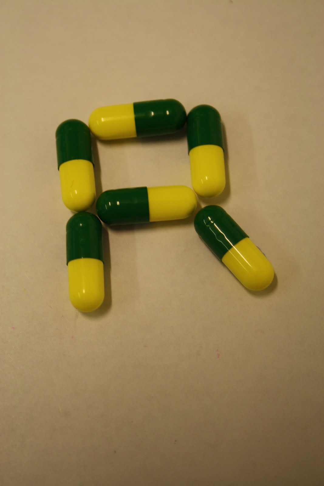
Below, for the Doctor, doctor I used a font called Anatomie.

I thought the text might look better smaller.

I have now decided this isn't at all suitable, it is far too comic strip like, which is not a serious enough tone for the piece.

I really like this one, the font is called Flatline, and I created a pink grid in the background to represent an ECG reading.

- 'Doctor doctor'
- 'Tiny dose of...'

This is to represent the quote ' a tiny dose of' in the context of the article it is referring to radiation, hence the text being in the shape of the radiation symbol.

Here, I| have used representative colours from an actual radiation warning symbol.
Below, for the Doctor, doctor I used a font called Anatomie.

I thought the text might look better smaller.

I have now decided this isn't at all suitable, it is far too comic strip like, which is not a serious enough tone for the piece.

I really like this one, the font is called Flatline, and I created a pink grid in the background to represent an ECG reading.

Image... Type As Image
BRIEF:
Select three quotes from the articles and visually communicate them using only the text in which they are written.
CONCEPT:
The context of a quote depends upon who said it, whom it was said to, the environment in which it is said and the tone in which it is spoken. Words do not exist out of context.
Working with type as image allows you to convey more than the words that have been written.
TARGET AUDIENCE:
Must be appropriate to each article.
TONE OF VOICE:
To reflect target audience.
CONSIDERATIONS:
Think visually. Will the quote exist in the environment, on someone's hand or a wall.
MANDATORIES:
All images must be supported by a broad body of work. The final images should be presented on an A1 portrait format. All type must be based on existing typefaces.
DELIVERABLES:
Three visually resolved quotes submitted on A1.
DEADLINE:
27th January 2011.
Select three quotes from the articles and visually communicate them using only the text in which they are written.
CONCEPT:
The context of a quote depends upon who said it, whom it was said to, the environment in which it is said and the tone in which it is spoken. Words do not exist out of context.
Working with type as image allows you to convey more than the words that have been written.
TARGET AUDIENCE:
Must be appropriate to each article.
TONE OF VOICE:
To reflect target audience.
CONSIDERATIONS:
Think visually. Will the quote exist in the environment, on someone's hand or a wall.
MANDATORIES:
All images must be supported by a broad body of work. The final images should be presented on an A1 portrait format. All type must be based on existing typefaces.
DELIVERABLES:
Three visually resolved quotes submitted on A1.
DEADLINE:
27th January 2011.
Wednesday, 19 January 2011
Image... Editorial: Evaluation
When this brief was first set, I had my mind focussed on using photography, as my illustration skills are weak and as the duration of the brief was very short, I decided photography would probably be easier rather than learning to draw. However, for the subject matter of the articles it would be difficult to use photography for my ideas in such a short space of time. At this early stage of the brief, I decided the brief was against me, and I wasn't very enthused by it.
I chose to create the illustrations on the computer for neatness and versatility as previously mentioned my hand rendered skills are not great. My initial sketches were hand drawn, and I now realise they did not take into account the shape and size of the space given for the illustrations.
This is probably one of the first briefs I have ever been given where I was told I could not leave the room until I had decided my outcome, part of me wished I had experimental time, but looking at the length of the brief this was incredibly useful, and I was surprised at how quickly I arrived at a decision, and I stuck with it.
My images I created are average, they look much better on their own, as with the article it doesn't seem to fit, but I am proud that I was able to illustrate on the computer, it is not my forte usually, and I really enjoyed it.
I chose to create the illustrations on the computer for neatness and versatility as previously mentioned my hand rendered skills are not great. My initial sketches were hand drawn, and I now realise they did not take into account the shape and size of the space given for the illustrations.
This is probably one of the first briefs I have ever been given where I was told I could not leave the room until I had decided my outcome, part of me wished I had experimental time, but looking at the length of the brief this was incredibly useful, and I was surprised at how quickly I arrived at a decision, and I stuck with it.
My images I created are average, they look much better on their own, as with the article it doesn't seem to fit, but I am proud that I was able to illustrate on the computer, it is not my forte usually, and I really enjoyed it.


Tuesday, 18 January 2011
Image... Editorial: Tim Dowling
Development for Tim Dowling:
The space for this illustration is quite an odd shape, so I thought of either creating a situation through illustration for example something Tim refers to in the article is being hit with a dart on the sofa and eating whipped cream straight from the nozzle, I could combine all the ideas into one image. Or create two images, but still related.

- I needed a long, landscape image to be used at the bottom, and felt the calendar pages idea would be appropriate. Combined with the previous illustration will make the final image.

The space for this illustration is quite an odd shape, so I thought of either creating a situation through illustration for example something Tim refers to in the article is being hit with a dart on the sofa and eating whipped cream straight from the nozzle, I could combine all the ideas into one image. Or create two images, but still related.
- This is a vector image I created of the author swearing at his cat. I wanted to create something really simple and minimal and focus on the swearing, with the title of the article about New Year's resolutions, and this image it straight away shows that this is one of the resolutions.

- I needed a long, landscape image to be used at the bottom, and felt the calendar pages idea would be appropriate. Combined with the previous illustration will make the final image.

Monday, 17 January 2011
Image... Editorial: This Column...
Really running out of time so had to go with my first idea which I actually quite like:

This illustration represents the passage '...in the form of £1 coins, stretch several times to the moon and back'.
Sunday, 16 January 2011
Image... Editorial: Relationship Maths
Development for the Relationship Maths article:
For this illustration I really wanted to represent facebook and relationships rather than the mathematical side of the article.
- Using the facebook logo colours I have created what I believe to be a representation of relationship, using the male and female symbol. Also, symbols are used in maths and science.

- I then thought it may be more appropriate to colour each symbol with its 'typical' gender colour.

- I thought the above image was a little bit too bubblegum, and applied a chalk effect, as it softens the image and also, maths makes me think of school and chalk boards. Adding in the facebook logo, puts the image in context to show the article is about relationships on facebook.

For this illustration I really wanted to represent facebook and relationships rather than the mathematical side of the article.
- Using the facebook logo colours I have created what I believe to be a representation of relationship, using the male and female symbol. Also, symbols are used in maths and science.

- I then thought it may be more appropriate to colour each symbol with its 'typical' gender colour.

- I thought the above image was a little bit too bubblegum, and applied a chalk effect, as it softens the image and also, maths makes me think of school and chalk boards. Adding in the facebook logo, puts the image in context to show the article is about relationships on facebook.

Saturday, 15 January 2011
Image... Editorial: Doctor, doctor
Development for the Doctor, Doctor article:
- Cell idea taken from rough illustrations in sketchbook, grey outline to represent the older generation.

- Experimenting with blue; gives a more clinical, medical feel.

- Reverting back to grey and experimenting with complimentary grey hair!

- Adding in a subtle hint of colour, still keeping the grey too. The illustration is beginning to look more refined.

- Trialling out including a walking stick and omitting the hair. I have also gone back to the blue as the grey is no longer necessary in representing the target audience, and the blue will compliment the existing illustration for the other article.


- Cell idea taken from rough illustrations in sketchbook, grey outline to represent the older generation.

- Experimenting with blue; gives a more clinical, medical feel.
- Reverting back to grey and experimenting with complimentary grey hair!

- Adding in a subtle hint of colour, still keeping the grey too. The illustration is beginning to look more refined.

- Trialling out including a walking stick and omitting the hair. I have also gone back to the blue as the grey is no longer necessary in representing the target audience, and the blue will compliment the existing illustration for the other article.

- Here I have added back in the grey hair. I think this works, and therefore this is ready to be placed in the article.

Image... Editorial Articles

This is a question and answer page and the illustration to be produced is for the medical questions, so the theme is health. The tone of voice is quite serious and informative. Visually, there are so many different ideas that can be done, as health is a broad topic. I would really like to use photography for this article in a way that complements the existing imagery.

This page needs two images, one for a article about the mind perceiving numbers in quite a light hearted manner, and the other article is about Facebook, and the number of friends a person and their partner has, which personally I find a load of rubbish! The ideas for the first image are mainly illustration based, a weak area of mine, and would illustrate some of the humourous ideas in the piece such as the 'Latte Factor'. The Facebook article would feature something maths related in conjunction with the Facebook logo.

Humorous article about the writer's New Year's Resolutions, again, this article produces so many visual ideas, and I think an illustration/comic style would be appropriate for this one.
Subscribe to:
Posts (Atom)