Wednesday, 14 December 2011

Final Evaluation


Looking back at my statement of intent, I have done what I set out to do in terms of the briefs I selected and processes I made. The briefs I selected incorporated at least one of the criteria from my rationale, ‘A layout driven investigation across print and screen with a focus on branding, identity and promotion.’ By choosing briefs that incorporated these,  I have produced work I feel can be included in my portfolio, and it is work I believe represents me as a designer.

I promised myself to start using Illustrator more, and I did, I barely used Photoshop, and I cannot understand why I haven’t used this program more regularly. I feel much more confident in the software, and it has really helped with all of my briefs. I did lack in confidence using illustrator files in After Effects, so this is an area where I did rely on Photoshop.
I did begin to start exploiting the use of Photoshop, more than I have done before, and it has allowed me to come up with much more creative ideas.  Although I did lose around 6 hours worth of motion graphics from not transferring files from the user work area, this meant I had to completely write out motion graphics from Brief 2, and a hurried decision into a final for Brief 4, as time was slowly running out.

I feel the briefs were answered to the best of my abilities, although I think where I am lacking is my final products, I have had some innovative concepts, but didn’t see them through, through lack of confidence. I believe the final products across all my briefs seem to be lacking, but I have to consider that the motion part for my briefs was extremely time consuming.

I also set out to take advantage of live briefs coming in, which I did, I created Brief 1 solely from a mixture of live briefs, which allowed me to work in different ways and paces. I particularly enjoyed the Mexican Museum of Design, as I have never really done illustration/pattern before, and I was pleased with the final resolution.

Brief 2 showed me the importance of taking a break, and taking a step back from a project when things aren’t going well. Without this break, I don’t think I would have produced the work I did. I took around a month break from it, and I benefited hugely and I came up with some designs and ideas I am really pleased with. I am disappointed I didn’t do the motion side to the deliverables, but I can learn from this mistake.

The third brief, allowed me to do what I enjoy, After Effects. When I wasn’t getting frustrated with rendering, I really enjoyed creating the deliverables for this, and I learnt a lot from taking the idea from screen to print, there were around 4 attempts of printing where the eye didn’t come out very well at all.

The D&AD brief, brief 4, I really enjoyed, it was a challenge from the beginning, working with a new target audience was extremely daunting until I had enough research to initiate ideas. I only wish I had used my own film footage, but lack of knowledge and equipment meant this was unachievable.  Again, I was able to use After Effects again, although I think my logo animations seem too simple, but I felt this was necessary because of my target audience, who probably wouldn’t care what the logo does.

I have got so much out of this module, I have learnt how to manage multiple projects at once, to a certain extent, although I could still improve on that immensely. I have learnt more into creating better presentation boards, and the layout skills that come with it, again, layout is a part of my rationale. Again, like with all other modules, I have learnt the hard way, I must blog as soon as the work is done, I did this up until about November, when I started getting really busy, and the ‘to blog’ pile got higher. Contextually, I have got a lot out of this module, as I am interested in working with graphics for television, I have learnt a lot about Channel 4, BBC and ITV, especially when it comes to branding and promotion. I found it interesting to see the guidelines for Channel 4 and how it works, which informed my own practice with Brief 4.

I managed to secure another work placement at Urban Feather, I very much enjoyed this again, and have been invited back at Christmas. As I have been busy with this module, I didn’t make the time to look for other companies, apart from my interview at ITV.

Tuesday, 13 December 2011

Work Placement Board + Evaluation

Due to not having access to all of the high resolution files, only two of the posters were submitted. I am pleased with how they turned out, I understand the client was very happy with them, even if it isn't my usual style or type of work. It was great to work on a live project, and it was all produced in Quark which I had never used before and was introduced to a few hours before I had to have these posters ready. I couldn't even work out how to place an image. A huge challenge, but I managed with some trial and error.

Brief 4 Boards + Evaluation

I was incredibly excited about this brief at the start, it was by 4Creative (who I would love to work for), working on branding (in my rationale) for a new television channel (an interest of mine) - it couldn't be more perfect. However, the target audience was over 60's, an audience I know very little about, time was ticking and I didn't have much time to do in depth research into them, however I gathered primary and secondary research that I felt was reliable enough to draw some assumptions and base my concepts around this. The idea of branding was very appealing, but to a new television channel, it is my dream brief. I thoroughly enjoyed working on this, however I feel a major weakness is using stock film footage - due to my lack of equipment and knowledge of film, but they supported my ideas wonderfully. IT really finishes off what I have working alongside, as an animated logo on its own didn't seem as entertaining as a dog in what seems to be a pair of older person's glasses looking at my animated logo and then looking directly down the camera at the viewer. I enjoyed creating the guidelines for the branding too. It seemed to make my idea more credible and more genuine, and the research behind all this was very interesting too, I learnt a lot about branding and design for television.

Brief 3 Boards + Evaluation

This was a very confusing brief,in my first tutorials I somehow managed to talk my way around the brief, each time with something different. It wasn't until a crit with Sai, Pav, Brady and Richard, that it was pointed out - what is the brief asking of me. I couldn't answer this, so a quick brainstorming session developed a straightforward, clear brief, still on the same topic, but more geared towards my interest; design for television. Up until this point the ideas and development had been little to non existent, and now I had a focus, I was able to go ahead and make a start. Once I finally got started I was really enjoying the brief, especially the motion side, I had come up with a strong visual that I have used throughout my printed and on screen campaign, and it's something I am really pleased with. Originally it was a stock image, but it seemed like cheating, so I developed my own similar version. The motion part saw me being braver and trying new things, which is what I set out to do at the start of the year. I found it hard to come up with printed deliverables for this brief, as you don't seem to see television programmes advertised via print.

Brief 2 Boards + Evaluation


This is the brief that caused me the most difficulty, to begin with I was excited and came up with a logo I was pleased with, and I think at this point, I spent too much time creating stuff, instead of actual work that was for a purpose. At this point I wish I had moved on to another brief, but I was that worried about time, I carried on creating unsatisfactory work. Having a break from the brief allowed me to look at what I had done with fresh eyes, and totally turn my ideas around. I spent at least a week producing work that has been completely scrapped, when this week could have been used developing other briefs. This is something to learn for the future. This brief allowed me to explore branding and promotion, which is what I want to carry on doing, and it is in my rationale. I struggled with creating a brand/idea/concept for a target audience that was as vast as what I had to work with, the different demographic of people in a hospital is very vast, and this brief was about appealing to as many people as possible. I feel I should have taken forward my ideas to my presentation boards, instead of not developing them further. I had already been told to push my deliverables, which should have been my wake up call.


Brief 1 Boards + Evaluation

This brief allowed me to investigate a wide range of different graphics areas, but still concentrating on promotion, part of my rationale. The Bloc+Blur brief wasn't the most exciting brief I had worked on, as I really wanted to put my creative stamp on it, but due to the large restrictions it was more about layout, which is still part of my rationale, so in this respect I had fun experimenting with different layouts. The Fatboy Slim brief was fun, I am really pleased with the outcome, and the concept, I think its quite powerful, it has had some good feedback from peers too which is always good to hear. This saw me working in a CD cover size, and again I experimented with layouts. The Manchester Book Fair Brief got very confusing, originally the brief was supposed to be a hotdog fold book with the rejected Mexican Museum of Design briefs ideas, then it became a book of patterns, before finally being a set of affordable notebooks. Due to all the changes the books didn't end up going to Manchester. The D&AD brief was a quick turnaround brief for the North Lecture, this was a brief that really appealed to me as it was about experimenting with layout, and I am really pleased with the final poster, I think it is portfolio worthy.


To-do List


Monday, 12 December 2011

Photographing My Products

I found this incredibly hard as my automatic focus had broken, and my eyes were strained from staring at the screen all day, so I didn't get many good photos, although here are a few - not edited:


Urban Feather Work

Unfortunately, I wasn't sent any of the development work, but here are my final posters: Client: Chirohealth Brief: To create some A1 posters promoting Chirohealth, within current branding.

Sunday, 11 December 2011

New Poster Final


I have used two bright greens from the logo colours, the reason being as mentioned in the post about the other poster. This will really stand out from the hospital signage - these posters are designed to be put up once the gallery has opened to fill in some missing gaps from the first one! Bringing art into hospitals is pretty straight forward, the poster does what it says, but for those who aren't necessarily interested in the art as such, it will be an ideal place to reflect and relax, a brighter more enjoyable place than the hospital wards.
These will be printed on the same stock as the previous ideas, a matte card, the dimensions for these are 420mm by 200mm.

New Gallery Poster Final


This is the final choice for the poster that will be posted around the hospital while the Gallery is being installed. The bold green is enough to stand out from the usual blue seen around hospitals. The type written in white also stands out, in a friendly informal font, again different from the usual typefaces from hospital signage, it also reinforces the idea of the white space - the gallery will transform the empty dull space.
This is a good way of exposing the brand and to create curiosity, until a week later when the gallery will open, and the next set of posters with the location on it.

Exhibition Poster Final

This will be in A4 format displayed in the gallery and on the door to the gallery: it will not be displayed around the hospital to avoid confusion with the Serendipity advertising. There was going to be a postcard sized version, for distribution around the hospital, but again to avoid any confusion, the signage for Cynosure is for in the gallery only.

Friday, 9 December 2011

Poster Ideas

Now I have a set design for the bookmarks and pre-gallery launch posters, I can apply it to the posters that advertise the gallery itself. I am really happy with the way this brief is going now, I actually hate my previous ideas. The break from this project has been really beneficial, it has allowed me to come up with new ideas and regain my positivity and excitement for this brief. The posters will be printed on the same matte stock as the bookmarks. The posters for the toilets will be laminated. The dimensions for the first batch are 594mm by 200mm and the second batch which I think work better are 420mm by 200mm. I will pick a final 'Bringing Art into hospitals' and a final 'A place to...' both in a different shade of green, as mentioned previously I don't want my advertising to me mistaken for NHS signage. Together the posters explain what Serendipity is about, I didn't want a poster with a really text heavy basis, as people don't want to stop and read it, especially in a hospital, when people don't particularly want to be there in the first place.

New Letterhead Final

This will be my final letterhead, the logo and address are in the top right hand corner as this is quite a conventional layout, with a coloured bar across the bottom of the page using the same colours from the logo. Without the coloured bar it looked slightly bare, and as this is an art gallery I wanted to make it bright and colourful without it looking to informal. The dimensions are A4, 210mm x 297mm, and printed on usual 90gsm copier paper as Serendipity is a free service, and so funds for stationery and printed materials must be kept to a minimum. The address is aligned to the right in Century Gothic, this is because it is similar to the New Garden (logo) font, so it keeps the visual uniform. It isn't exactly the same layout as the business card as I decided I wanted the logo centralised for the business card so it stood out, so it made sense to have the address as one line of copy, obviously I can't centralise the logo on the letterhead. I think it is clear that it is a set.

New Business Card Final

This will be the final business card, I think it works really well, considering the original business cards would have been based on the original letter heads which are truly horrible! I think I can take this idea and develop it into a decent looking stationery set with a letterhead and with compliments slip. This is 85mm by 55mm and on the same matte stock as the posters and bookmarks.

New Letterhead Ideas

A newer development of the letterheads, I am much happier with these variations they are much more consistent with the current design.

Business Card Ideas

These are ideas for a business card, again, my head has been much clearer to design these after having a much needed break from this brief. As a touring gallery, Serendipity will need some kind of headquarters where people can get in contact, so it felt necessary to create business cards. It would be ideal for example in a scenario, where someone from Serendipity meets an artist where their work would be suitable for the gallery.

New Gallery Poster

Again, with fresh eyes I have been able to focus on producing some more refined variations. I will only need one poster for the doors to the ward where the gallery will be under construction. I have kept the design similar to the bookmark for a more uniform look.

Final Bookmarks

I originally was going to produce one, which I have but 9 colour variations, of the different colours from the logo. There won't be a blue outline, this is purely to illustrate the boundaries, the size of this is 14cm x 4cm:


More Bookmark Variations

Looking back at the dreaded Brief 2 - I need to rework it, I can't keep ignoring it, the submission is soon. Time to have a break from motion and finish this once and for all.


I have actually enjoyed working on it this afternoon - it proves looking at something with fresh eyes does help and I took it straight to print, I am pleased with the outcome. I just can't decide whether to laminate them or not, to make them more durable. As they are just on a matte card.

The colour scheme is based on colours in the logo, I love how fresh they look! After printing them all out they work really well as a set. For some of the advertising for the gallery I may stick to the greens to differentiate from the blues used around the hospital - especially as one of the blues is quite similar to the NHS blue.

Thursday, 8 December 2011

Final Crit Feedback


This is the action plan I came up with after reading my feedback, I found the crit really useful. I clearly had no idea about point size on my boards, so it was useful to not only see others' work, but be told it is wrong. From here I could work on the hierarchy, as with my mock-up boards, there seemed to be no hierarchy at all. For some unknown reason I used block capitals throughout all my boards, which made them difficult to read and it looked like I was shouting at the readers.
It was handy to know that it was clear what my briefs were about, because I know what my briefs were about, and after staring at the boards for a length of time it is hard to look at the boards objectively.
Also I found it handy to have a group who didn't know what my briefs were so they weren't able to fill in the gaps from previous crits.

Final Crit Boards

For the purpose of the crit, these will be printed in Black and White, I am keen to get answers to these questions:
- Is the text too large?
- Is the information clear enough
- can you understand my brief?
- Shall I include my work placement board?
- Are the images all right
- too many/ not enough?

 Boards:


Wednesday, 7 December 2011

More Test Idents

Still haven't made up for the work lost yesterday, but I think it may have to wait, here's some more test idents. Mainly focussing on the dog version (the shorter duration ident) as I think I found a final in the blue sky variations yesterday:

Test Ident 18:
 
 Test Ident 19:

 Test Ident 20:
 
Test Ident 21:
 
 Test Ident 22:

 Test Ident 23:
 

Tuesday, 6 December 2011

More Test Idents

Test Ident 12:


 Test Ident 13:

 
 Test Ident 14:
 
 Test Ident 15:
 

Above, I have overlayed two of the movies on top of each other so I can create this flying/floating effect with the camera.

Test Ident 16:


I have changed the path the camera moves in this one.


 Test Ident 17:
 

I hate user work!


This is what happens when you lose 6 hours worth of work - because of the stupid user work folder.
Lesson learnt.

Test Idents

Test Ident 1:
 

Test Ident 2:
 
 Test Ident 3:
 
 Test Ident 4:
 
 Test Ident 5:
 
 Test Ident 6:
 
 Test Ident 7:
 
 Test Ident 8:
 
 Test Ident 9:
 
 Test Ident 10:
 
 Test Ident 11:
 

Dog Test Animations

One of the stronger concepts I found to do with the over 60s was a dog - this could have lots of visual possibilities! I started by drawing a dog to be animated in After Effects, I have never done this kind of animation before and I have a feeling its too late in the game to try new stuff, so it may well be ditched!

'Its the concept not the finish' (as Marlon Griffin [who has directed adverts for Coca Cola and Nike!!] told me)!!

My slightly dysfunctional looking dog:


Dog 1:


Dog 2:


Dog 3:


Dog 4: Dog 5:

Monday, 5 December 2011

Final Motion Graphics

The following two will be my final trailers (16 seconds long), both with different beginnings, but still communicating the idea of the mystery of CCTV. The question 'Who is watching you?' is to leave the viewer wondering and curious about who might be watching them, as many people are unaware of when they are in fact on CCTV. This curiosity is designed to lead them to watch the programme. To me these two communicate the best what the programme is about without saying this is a documentary on CCTV. I wanted to leave a sense of mystery. The abrupt ending is on purpose, almost like the tape has been cut off. Final 1 for TV: Final 2 for TV: This will be my final sting, it only just fits into the guidelines set for the duration of the sting - under 7 seconds. It is short enough to get the title, day and time across, and for those who have seen the trailer will be aware of the programme topic, those who haven't may be curious (or confused). The impact noise should attract the attention of whoever isn't looking at the TV screen. Sting (with sound) for TV: Sting (no sound - for Digital Escalator Panel boards)

More Stings


This is a shortened version, however the text is visible at the beginning, which shouldn't happen.


I used opacity on the text here starting with 0% right at the beginning reaching 100% at the eye. A few more frames have been shaved off here, it is nearly finished I believe.


This is the same as the previous one, but I have put that static noise back in, I quite like how the static works with the animated text.


This was something new I was playing about with, creating a shatter effect. There is no sound on this version.


I found a suitable glass shatter noise here, however, the ending isn't very smooth.


This has a much smoother ending.

Friday, 2 December 2011

Identity Guidelines (so far)

As this is a brand I am creating, I have developed a set of guidelines to accompany, in a similar style to the already existing e4 and Channel 4 guidelines, but obviously in keeping with Your 4.


Tube Vector

My selected billboard image will also be used for a London underground advert proposal following my research on the London Underground advertising, by CBS Outdoors:


More Billboard Layouts

Web Feature

Colour variations for the Sky Web Feature. The design has to be kept to the Sky version, so the only freedom really is the image and colours.


Based on the original banner that was there, see below (this is not my work):


I recreated the gradient in a similar way so it would match up:


There aren't many different ways that this can be done as it needs to follow the template of the Sky website, this is how it may look. I prefer the original grey gradient as it corresponds with the grey in the image, and the blue stands out more.


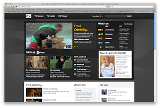
This is how the Eye Spy feature may fit in on the ITV website, again, with the already built in template, there are quite a lot of restrictions, I couldn't even experiment with colour here:

Original:

 With my Eye Spy:


Magazine Ad Layouts continued

The first half of these when I previewed them, I noticed an error with the image, this has been rectified. Also it doesn't say anywhere but I am pretty sure for off-air campaigns the ITV logo has to be on the right, so this also has been changed. According to the Ad Spec for the magazine it should be: Bleed 288 / 218 Trim 280 / 210

I thought, this magazine is for regular readers, particularly women with children, according to their statistics, so the 2 issues before the week of the programme to show the Who's watching you? advert with no information, and the week of the programme to display the one with the day and time and without Who's Watching You?


Thursday, 1 December 2011

Test Stings

Sting:
 

This is a silent sting and would be ideal for the digital escalator panels in London.

 Sting 1:
 

This has the impact noise back in it.

 Sting 2:
 

Test Trailers 3

Test Trailer 13:

This is with the corridor image, and the Teardrop song. The ITV logo isn't at the top of the layer palette like it should be, hence the reason it fades at the start. Lesson learnt!

 Test Trailer 14:

This is how it should be.

 Test Trailer 15:

I added in the date and time at the top for realism with the corridor image only I forgot to turn it off, and so it plays throughout the entire time.

 Test Trailer 16:

This is how it should have looked.

 Test Trailer 17:

A few friends thought the sound effects had more impact so I have resorted back to them. The sound is not in time here.

 Test Trailer 18:

The sound still appears to lag a bit in this clip.