The button must be simple, after reading an article on this web page http://www.smashingmagazine.com/2009/07/21/iphone-apps-design-mistakes-overblown-visuals/ the key, as always is simplicity, so a visually appealing yet simplistic design is what will be required for this. An image that says exactly what the app is about.
This could be a design for a male version and female version, which would feature compliments for women to say to men and women, and a male version for men to say to men and women. This could be an interesting idea, as if the app was to be unisex, it is important not to make the compliments too feminine to protect 'male pride'.
e.g.
Male App
Male compliment- That's a cool t-shirt you're wearing.
Female compliment- You look stunning in that dress.
Female App
Female compliment- I love that top, where is it from?
Male compliment- Your hair is looking really good today.
Instead of creating two apps- male and female, it could just be the button that is gender specific, as a gimmick, and the interface could give a selection of categories for who the compliment is for and what the occasion is.

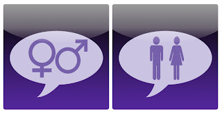
These could be buttons for if the App is going to be unisex, here, I have combined the symbols for both genders and a speech bubble, I feel this is an appropriate and simple design that could work well.
As for the interface of the app it needs to be familiar, an overstyled app is going to need instructions, people nowadays don't have time for this, they want something they immediately understand. So the app should visually be very similar to existing ones, no majorly fancy design work, something that simply communicates what needs to be seen.
This is potentially how the button may look in it's place on an iPhone, I have not put the text on as it is not crucial at this stage:
As the colours for the screen print did not come out as intended, I recoloured the icon to create the finished piece, whilst Meryem designed the app itself. The type added on is Helvetica.

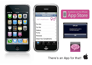
This is a design board I have put together to show how the app will look, Meryem designed the menus for the app and I did the icon/logo plus the compliment on the iPhone.


No comments:
Post a Comment