Tuesday, 25 January 2011

Top Ten... Crit Feedback Part 2


I agree with these comments, I think if I am clear and concise in my presentation, the subject matter can be communicated easily and instantly. I need to focus on my icons more...

I also need to look at doing my title sequence storyboards. In response to 'Are you naming them all in sequence - (Hollywood stars), I am not sure if I want to include any of them, I would concentrate on the Hollywood aspect for the titles and leave the programme to concentrate on the idols. Also, I don't want to give any clues out, I don't like watching film trailers that practically tell the entire story in 30 seconds.

The visuals were slightly lacking for the crit which explains some of the comments and I completely agree, I need to have the confidence to draw, its only a draft anyway!


Image... Type As Image: Evaluation

I really enjoyed this brief, picking the quotes at the time the brief was handed out forced me into making a decision quick, rather than time wasting.

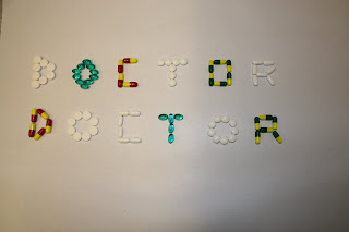
Picking the quotes was relatively easy, I figured picking two for each, and experimenting, would allow me to see which would give the stronger visual. For the Doctor, Doctor quote I instantly knew I wanted to experiment with using real tablets mounted to card. The other quotes took a bit more thought. My Facebook quote 'friends' was not as strong as I thought it would have been. Instead of being a white A1 of satin gloss with spot varnish it looked more like a plain sheet of paper, this is due to the lack of facilities for spot varnish, so I had to use a clear ink instead. I was aware that it may not be as successful, but didn't realise it would turn out like it did. This may be a reason my work disappeared, it did just look like plain paper.
The 'cat doesn't speak english' took a bit more thought, and I am pleased with the outcome, using an Arabic font that almost looks illegible really portrays the language barrier between owner and cat.

On the whole, I was pleased with the work I produced, and would like to continue using type as image in the future, it's a strong and visual method of communication.

Image... Type As Image: Article 4

- 'The cat doesn't speak English.'

- 'I am either angry, frightened or drunk.'

Top Ten... Clarification

These are my presentation boards redone to clarify exactly what I set out to do:


Top Ten... Stroke Effect Test

Testing out the stroke effect using Honey Script...

Title Sequence... Stroke Effect from Gemma Byrne on Vimeo.

Monday, 24 January 2011

Top Ten... Storyboards

Quick biro ideas for my idents: (not to timescale)

1) I really like the idea of making a red carpet roll out, I think this would really communicate the Hollywood glamour to my audience. I am not sure how I would go about doing this, however I shall investigate. This could be used as a way of displaying the title, which could unravel with the carpet.


Or the camera panning down the red carpet with the title appearing.


2) An element of Hollywood I would like to incorporate in my ident is the Hollywood Walk of Fame, the camera would pan down the path before zooming in on one of the stars with the title on.


3) The famous Hollywood sign would make an interesting visual point for an ident, I would have to create the setting first with the jagged hills, then placing the text on. I am not sure if I would use the title in Honey Script with Hollywood in the traditional sign, or all in the style of the sign.


4) A true Hollywood icon- the Oscar. This would be in 3D rotating round 360 degrees before zooming in on the plaque with the title on.


5) The title appearing on a director's chair.


6) A clapper board flying into shot, the title would appear on the board, before the board snaps into place ready for 'ACTION'.


7) Not entirely Hollywood related, but some animated film strips would be cool.


8) Again, not just associated with Hollywood, but the countdown you used to see in the cinemas would be a cool asset to add to my sequence, or as part of an ident.


9) Another cool idea would be to have a bucket of popcorn with the title 'popping' out of it.


10) A limousine entering the shot, with the window winding down to reveal the title in a wipe would be a more Hollywood idea.


Image... Type As Image: FINAL Doctor Doctor


Sunday, 23 January 2011

Image... Type As Image: Article 3

Original pick of quotes:

- 'Your relationship will soon be over - or it is already.'

- 'Friends.'

I chose to go with 'friends' as I had more ideas for this quote than the previous one. Here are a few of my ideas:


This idea is to emphasise the vast number of 'friends' people have on facebook, but how many are real, solid, true friends?


This is illustrating the same idea, but instead the main text is the Facebook colour.


This is the final piece and will be printed using a spot varnish on white satin gloss paper, to illustrate how some friends, particularly Facebook friends aren't always there for you. The original print of this has since disappeared after presenting to the class.

Saturday, 22 January 2011

Image... Type As Image: Article 2

Original pick of the quotes:

- 'This column will change your life.'

- 'Warm glow.'

'This column will change your life...'


Here is an attempt to show the word column in the physical sense; a column of colour.


I actually don't think this works at all, terrible idea.

From the two above ideas alone, I am pretty sure I will pick 'warm glow':


This was my first idea, based on a make-up advert I have seen for bronzer for a warm glow. However, in this context it looks slightly murky.


I think this would portray hot more than glow.


This has two colours used to brighten the image up slightly.


I think this is a brighter but still representative example of the phrase warm glow.

Image... Type As Image: Article 1

Original pick of quotes:

- 'Doctor doctor'

- 'Tiny dose of...'


This is to represent the quote ' a tiny dose of' in the context of the article it is referring to radiation, hence the text being in the shape of the radiation symbol.


Here, I| have used representative colours from an actual radiation warning symbol.

Below, for the Doctor, doctor I used a font called Anatomie.


I thought the text might look better smaller.


I have now decided this isn't at all suitable, it is far too comic strip like, which is not a serious enough tone for the piece.


I really like this one, the font is called Flatline, and I created a pink grid in the background to represent an ECG reading.

Image... Type As Image

BRIEF:

Select three quotes from the articles and visually communicate them using only the text in which they are written.

CONCEPT:

The context of a quote depends upon who said it, whom it was said to, the environment in which it is said and the tone in which it is spoken. Words do not exist out of context.

Working with type as image allows you to convey more than the words that have been written.

TARGET AUDIENCE:

Must be appropriate to each article.

TONE OF VOICE:

To reflect target audience.

CONSIDERATIONS:

Think visually. Will the quote exist in the environment, on someone's hand or a wall.

MANDATORIES:

All images must be supported by a broad body of work. The final images should be presented on an A1 portrait format. All type must be based on existing typefaces.

DELIVERABLES:

Three visually resolved quotes submitted on A1.

DEADLINE:

27th January 2011.

Thursday, 20 January 2011

Top Ten... Brainstorm Part 2

Associations with Hollywood:

Wednesday, 19 January 2011

Image... Editorial: Evaluation

When this brief was first set, I had my mind focussed on using photography, as my illustration skills are weak and as the duration of the brief was very short, I decided photography would probably be easier rather than learning to draw. However, for the subject matter of the articles it would be difficult to use photography for my ideas in such a short space of time. At this early stage of the brief, I decided the brief was against me, and I wasn't very enthused by it.

I chose to create the illustrations on the computer for neatness and versatility as previously mentioned my hand rendered skills are not great. My initial sketches were hand drawn, and I now realise they did not take into account the shape and size of the space given for the illustrations.

This is probably one of the first briefs I have ever been given where I was told I could not leave the room until I had decided my outcome, part of me wished I had experimental time, but looking at the length of the brief this was incredibly useful, and I was surprised at how quickly I arrived at a decision, and I stuck with it.

My images I created are average, they look much better on their own, as with the article it doesn't seem to fit, but I am proud that I was able to illustrate on the computer, it is not my forte usually, and I really enjoyed it.

Image... Editorial Finals