Showing posts with label Wrap It Up. Show all posts

Monday, 18 October 2010

Wrap It Up... Final Designs

How to Fold: Business Card Holder
This will be seen on the outside...

And it will fold out to look like this on the inside...


Mail It: Receipt Envelope


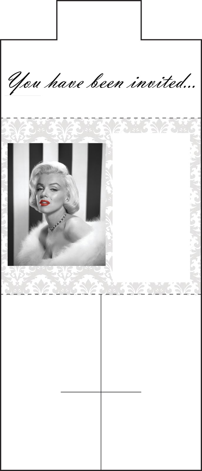
The horrible solid and dashed lines will not be visible but are just to show where the visuals are in relation to the net boundaries.

How To Fold: Mail Shot Invitation


Wednesday, 13 October 2010

Wrap It Up... Nets

Display/Publicity:


This style of net would be appropriate for a mail shot and is very similar to the net I used for No News Is Good News. It would also make a good invite, to invite people to the opening of the shop.


How to Fold:
(Still need to pick a suitable net)

This would make a good fold out poster - small and portable as a folded product but can be folded out to reveal information and or an image.


This would fold up into an envelope style net, this could be useful as a business card holder.


Mail it:


This is one of my favourite nets, it will fold up to be like a pick and mix bag, which can expand ever so slightly to accommodate for thicker products, it could be used for all manner of things, a receipt envelope, a mail shot, a form of jewellery packaging...

Special Packaging:


This is a different variation on a standard cube, the cut away means it would be great as display packaging.

Structural Packaging:


This would be good to package something a little bulkier than normal and the cut away tag on the top peans it can hang on a rack too, ideal in a shop situation. As soon as I saw this I just thought of the packaging my ink cartridges come in, and I suppose the format is quite plane, so I would have to use the visuals in a really creative way to make the product eye catching and desirable.

Wrap It Up... One Word, One Image

My chosen word:
Originally was going to be Vintage but that seemed too obvious so I went with...
...Retro.

Retro can be used to simply mean “old fashioned” or old, functioning much like “timeless” or “classic”. It is a culturally outdated or aged style, trend, mode, or fashion, from the overall postmodern past, that has since that time become functionally or superficially the norm once again. The use of "retro" style iconography and imagery interjected into post-modern art, advertising, mass media, etc. It was popular in the 1950s. - Wikipedia.

My chosen image:
Marilyn Monroe, a world famous all round icon, I think she makes a great 'face' for the fifties, which is the era I am choosing to pick, as I have looked at a variety. It was hard to pick an image as she looks glamourous in every single photo...


The colours in this image don't fit the mandatory section of the brief (2 colours plus stock). To keep with the vintage idea, I could use greyscale on white stock...


This looks great, and what might work even better, is to keep the lips red for a feminine touch, and this would still comply with the brief...


I have my chosen word and image, now I need to look at the different nets.

Tuesday, 12 October 2010

Wrap It Up Brief...

Brief:
Identify, select and clarify 'good' in one word.
Identify image that represents research.
Choose one net from each of the 5 net groups and investigate them.

Mandatory:
2 colour plus stock - across the range.
Use 3 nets - no modifications.

Deliverables:
3 packaging solutions.
Design work - DP Blog.

Considerations:
Content - image? word? link the two...
Colour - appropriate.
Font.
Format/ form - inside and outside.
Media.

Deadline:
9:30 am Tuesday 19th October.